Fonts
Galactic Storm Gradient Italic Font
Description
- galacticstormgradital.ttf
- Font: Galactic Storm Gradient Italic
- Weight: Italic
- Version: Version Version 1.0; 2014
- No. of Characters:: 221
- Encoding Scheme:
- Is Fixed Pitch: 0
Welcome to the Font Trends page — your destination for discovering which fonts are shaping today’s design landscape. Whether you’re working on a brand refresh, social media visuals, or website UI, following current font trends helps your work feel fresh and relevant.
This collection features the most trending fonts of the season, chosen by designers and creators across the world. Expect to see elegant serifs, minimalist sans serifs, expressive display fonts, and handcrafted scripts that define modern aesthetics in 2025.
Combine your favorite trending typefaces with timeless categories like Modern, Serif, or Handwritten for a balanced and eye-catching design.
-
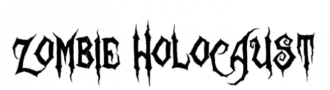
( Fonts by Sinister Visions - Chad Savage - www.sinisterfonts.com )
A bold, jagged font with a horror and gothic theme.
 Download 5575 Downloads@WebFont
 -
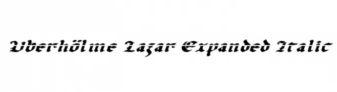
( Fonts by Daniel Zadorozny - www.iconian.com - Free for personal use )
A bold, italic, and decorative font with high contrast and expanded width.
![Uberhölme Lazar Expanded Italic Free Fonts Download]() Download 166 Downloads@WebFont
Download 166 Downloads@WebFont -
( Fonts by The Scriptorium - Dave Nalle )
A decorative, gothic-style font with thorn-like extensions and high contrast strokes.
![Linthicum Demo Free Fonts Download]() Download 340 Downloads@WebFont
Download 340 Downloads@WebFont -
![Suitribe Venice Style Free Fonts Download]() Download 3483 Downloads@WebFont
Download 3483 Downloads@WebFont -
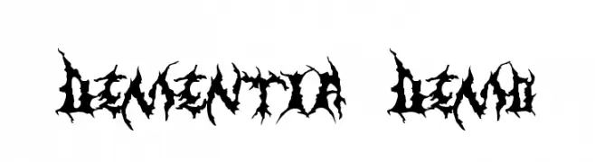
( Fonts by The Scriptorium - Dave Nalle )
A jagged, thorn-like font with an aggressive and chaotic style.
![Dementia Demo Free Fonts Download]() Download 877 Downloads@WebFont
Download 877 Downloads@WebFont -
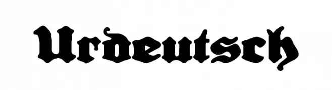
![Urdeutsch Free Fonts Download]() Download 430 Downloads@WebFont
Download 430 Downloads@WebFont -
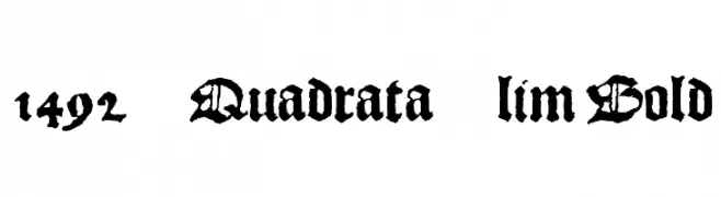
![1492_Quadrata_lim Bold Free Fonts Download]() Download 8504 Downloads@WebFont
Download 8504 Downloads@WebFont -
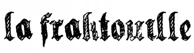
![la fraktouille Free Fonts Download]() Download 871 Downloads@WebFont
Download 871 Downloads@WebFont

FAQ — Font Trends
What are the current font trends?
Simplicity, legibility, and warmth dominate: rounded sans serifs, high-contrast serifs, and tasteful retro revivals are everywhere — clean but human.
Which fonts are trending in design right now?
Popular choices include Zombie Holocaust, Uberhölme Lazar Expanded Italic, Linthicum Demo, Suitribe Venice Style and Dementia Demo — fonts known for their balance between modern and timeless. They look great on web pages, social content, and packaging, bringing a clean yet expressive feel.
How do I use trending fonts in my projects?
Use one standout display font for titles and pair it with a simple sans serif for body text. This creates contrast without losing readability. Always test how your chosen font trend performs across screen sizes and branding materials before finalizing.
💡 Tip: Refresh key assets every few months with a new trending font to keep visuals sharp and discoverable.