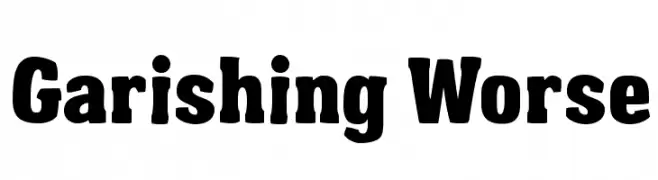
Garishing Worse Font
Garishing Worse Description
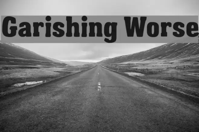
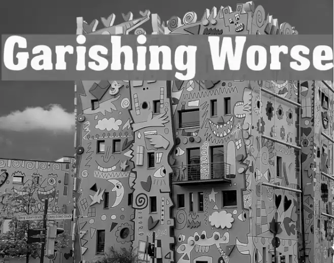
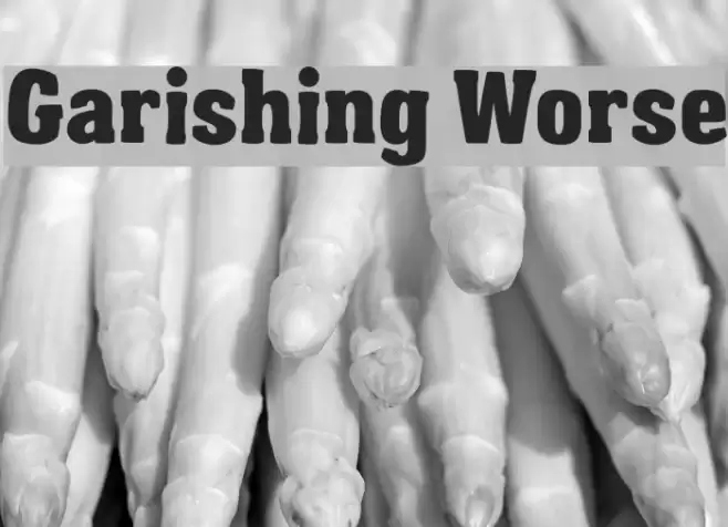
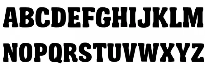
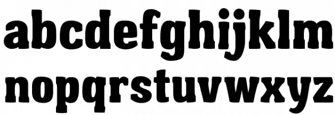
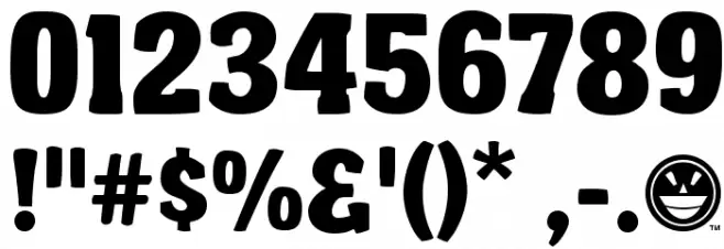
This font features a bold and robust design with thick, heavy strokes that give it a strong presence. The characters are uniformly wide, with rounded edges that soften the overall look, making it approachable yet assertive. The uppercase letters are particularly striking, with a sense of authority and impact. The lowercase letters maintain the same weight and width, ensuring consistency across text. Numbers and special characters are equally bold, providing a cohesive appearance throughout. This font's style is reminiscent of vintage poster typography, with a modern twist that makes it suitable for contemporary designs.
A bold, vintage-inspired font with heavy strokes and rounded edges from Uncategorized fonts.
- Downloads: 1,726
- Garishing_Worse_FREE.ttf
- Font: Garishing Worse
- Weight: Regular
- Version: Version Version 1.000
- No. of Characters:: 220
- Proposed Projects: Ideal for poster designs, branding projects, headlines, and any design requiring a strong visual impact.
- Category:
- Bold: Yes
- Italic: No
- Weight: Bold
- Width: Normal
- Character Spacing: Normal
- Contrast: Low
- Overall Style: Vintage
- Use Case: Headlines, Logos, Posters
- Encoding Scheme:
- Is Fixed Pitch: No
Glyphs ! # $ % ( ) * + , - . / 0 1 2 3 4 5 6 7 8 9 : ; = ? @ A B C D E F G H I J K L M N O P Q R S T U V W X Y Z [ ] ^ _ ` a b c d e f g h i j k l m n o p q r s t u v w x y z { | } ~
Garishing Worse UPPERCASE
Garishing Worse LOWERCASE
Garishing Worse OTHER CHARS
Gallery Examples