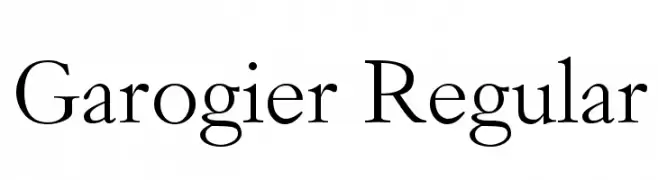
Garogier Regular Font
Garogier Regular Description
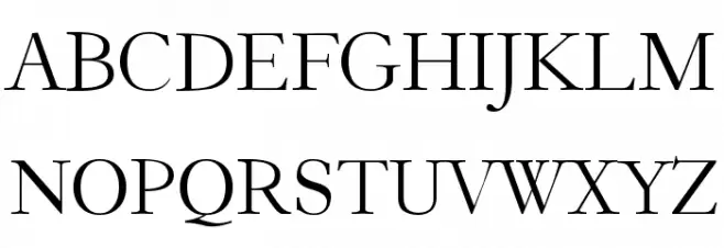
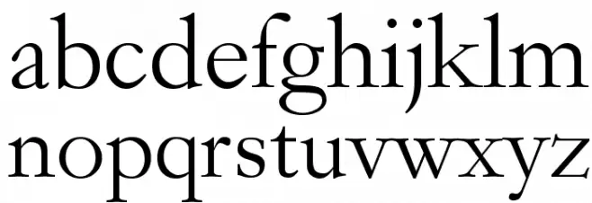
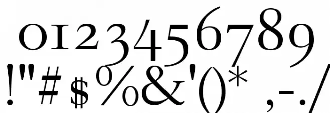
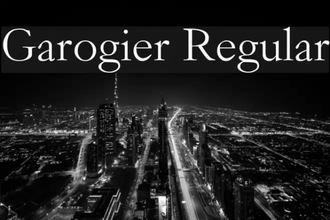
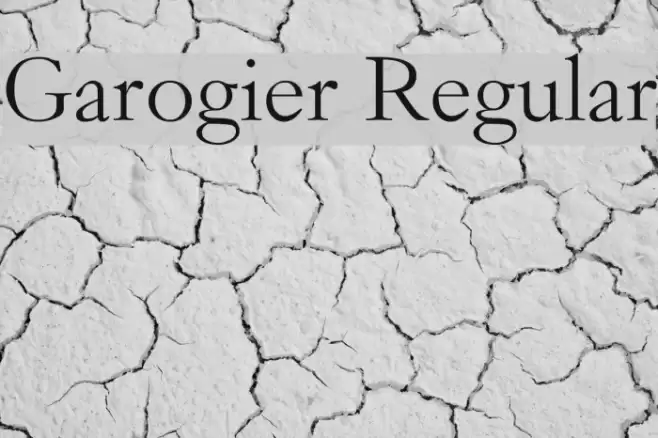
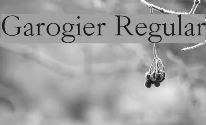
This font exhibits a classic serif style with elegant, thin strokes and moderate contrast. The serifs are slightly bracketed, giving it a refined and traditional appearance. The uppercase letters are tall and stately, while the lowercase letters maintain a balanced and harmonious look. The numerals are proportional and align well with the overall aesthetic, providing a cohesive look across different text elements. The special characters are distinct and maintain the font's sophisticated style, making it suitable for formal and professional use.
A classic serif font with elegant strokes and moderate contrast from Serif fonts.
- Downloads: 696
- ( Fonts by Rogier van Dalen - Personal-use only. For commercial use please contact owner. FREE )
- Garogier.ttf
- Font: Garogier Regular
- Weight: Regular
- Version: Version Version .50
- No. of Characters:: 398
- Proposed Projects: Ideal for editorial design, book covers, formal invitations, and branding materials that require a touch of elegance and tradition.
- Category:
- Bold: No
- Italic: No
- Weight: Regular
- Width: Normal
- Character Spacing: Normal
- Contrast: Medium
- Overall Style: Classic
- Use Case: Headlines, Body text, Logos
- Encoding Scheme:
- Is Fixed Pitch: No
Glyphs ! # $ % ( ) * + , - . / 0 1 2 3 4 5 6 7 8 9 : ; = ? @ A B C D E F G H I J K L M N O P Q R S T U V W X Y Z [ ] ^ _ ` a b c d e f g h i j k l m n o p q r s t u v w x y z { | } ~
Garogier Regular UPPERCASE
Garogier Regular LOWERCASE
Garogier Regular OTHER CHARS
Gallery Examples
Download Free Fonts
Commercial Fonts Fonts
-
 Buy font Apollonius Regular Commercial Fonts
 -
 Buy font Dinghybats Regular Commercial Fonts
 -
 Buy font Dinghy Regular Commercial Fonts