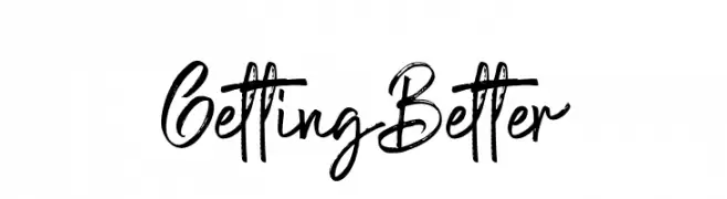
Getting Better Font
Getting Better Description
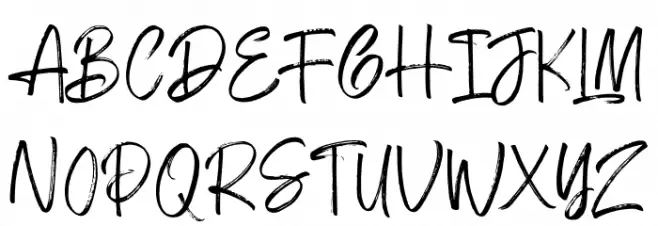
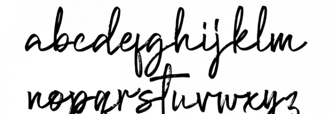
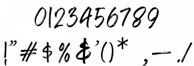
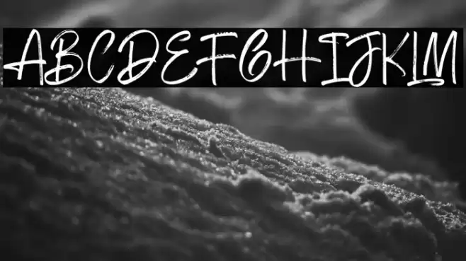
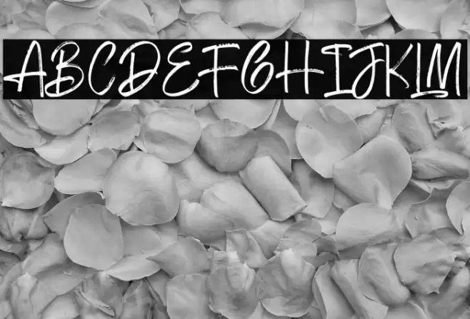
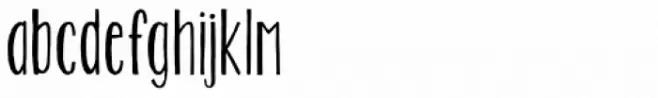
This font features a dynamic and expressive handwritten style, characterized by its brush-like strokes and casual elegance. The uppercase letters are bold and slightly irregular, giving a sense of spontaneity and energy. The lowercase letters maintain a fluid and connected appearance, enhancing the handwritten feel. Numbers and special characters are crafted with the same artistic flair, ensuring consistency across all glyphs. The overall design is both modern and playful, making it suitable for creative projects that require a personal touch.
A dynamic, expressive handwritten font with brush-like strokes from Uncategorized fonts.
- Downloads: 253
- ( Fonts by Alpaprana Studio - Personal-use only. For commercial use please contact owner. FREE )
- Font: Getting Better
- Weight:
- Version:
- No. of Characters:: over 20
- Proposed Projects: Ideal for greeting cards, invitations, branding projects, and social media graphics where a personal and artistic touch is desired.
- Category:
- Bold: Yes
- Italic: No
- Weight: Bold
- Width: Normal
- Character Spacing: Normal
- Contrast: Medium
- Overall Style: Modern
- Use Case: Logos, Headlines, Creative projects
- Encoding Scheme:
- Is Fixed Pitch: No
Glyphs
Getting Better UPPERCASE
Getting Better LOWERCASE
Getting Better OTHER CHARS
Gallery Examples

Download
253 Downloads
-
 Buy font KG Two Is Better Than One Commercial Fonts
 -
 Buy font Better Together Caps Commercial Fonts
 -
 Buy font Better Together Script Commercial Fonts