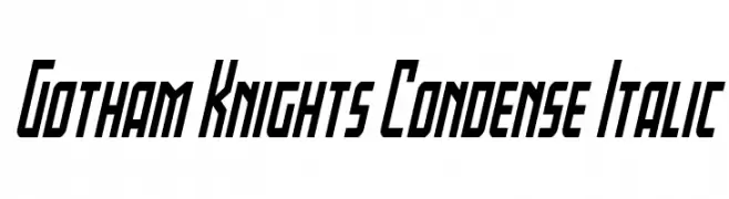
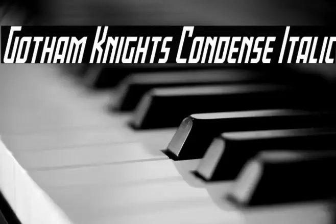
Gotham Knights Condense Italic Font
Gotham Knights Condense Italic Description
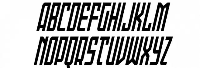
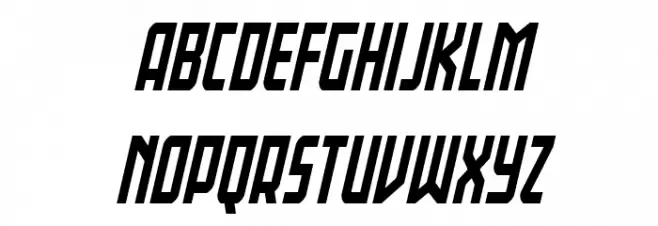
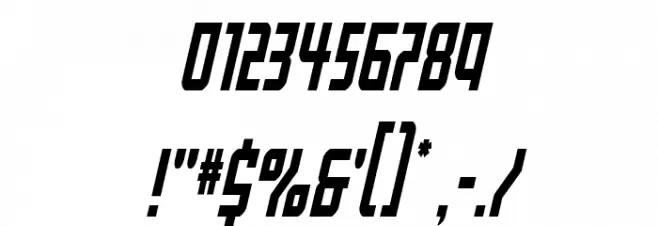
This font features a bold and dynamic design with a condensed and italicized style. The characters are sharply angled, giving a sense of motion and energy. The uppercase letters are tall and narrow, while the lowercase letters maintain a consistent height, enhancing readability. Numbers and special characters are designed to match the overall aesthetic, with a futuristic and sleek appearance. The font's strong geometric shapes and clean lines make it suitable for impactful visual statements.
A bold, condensed, and italicized font with a dynamic and futuristic style from Regular fonts.
- Downloads: 37
- ( Fonts by Iconian Fonts - Daniel Zadorozny - Personal-use only. For commercial use please contact owner. FREE )
- Font: Gotham Knights Condense Italic
- Weight: Regular
- Version: Version Version 1.0; 2022
- No. of Characters:: 222
- Proposed Projects: Ideal for sports branding, video game titles, posters, and dynamic advertising campaigns.
- Category:
- Bold: Yes
- Italic: Yes
- Weight: Bold
- Width: Condensed
- Character Spacing: Tight
- Contrast: Medium
- Overall Style: Modern
- Use Case: Headlines, Logos
- Encoding Scheme:
- Is Fixed Pitch: No
Glyphs ! # $ % ( ) * + , - . / 0 1 2 3 4 5 6 7 8 9 : ; = ? @ A B C D E F G H I J K L M N O P Q R S T U V W X Y Z [ ] ^ _ ` a b c d e f g h i j k l m n o p q r s t u v w x y z { | } ~
Gotham Knights Condense Italic UPPERCASE
Gotham Knights Condense Italic LOWERCASE
Gotham Knights Condense Italic OTHER CHARS
Gallery Examples


Download Free Fonts
-
 Buy font Knightsbridge Regular Commercial Fonts
 -
 Buy font OL Gotham Gothic Bold Commercial Fonts
 -
 Buy font Gothamburg Commercial Fonts