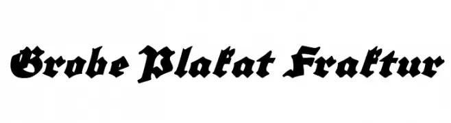
Grobe Plakat Fraktur Font
Grobe Plakat Fraktur Description
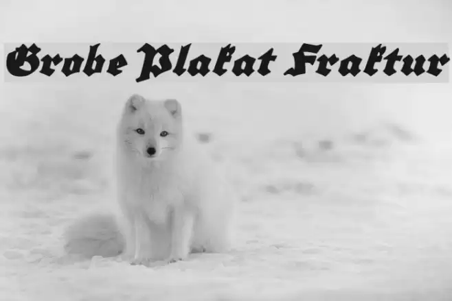
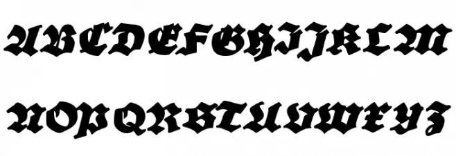
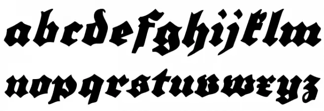
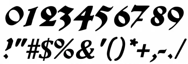
This font showcases a bold and dramatic style, characterized by its intricate and angular letterforms. The strokes are thick and pronounced, giving it a strong presence. The uppercase and lowercase letters maintain a consistent style, with sharp edges and a traditional feel reminiscent of historical scripts. The numerals and special characters follow the same design principles, ensuring uniformity across all glyphs. This font is ideal for projects that require a touch of elegance and historical depth, making it suitable for formal invitations, certificates, and branding that seeks to convey a sense of tradition and authority.
A bold, angular font with a historical and dramatic style from Uncategorized fonts.
- Downloads: 145
- ( Fonts by www.peter-wiegel.de - Personal-use only. For commercial use please contact owner. FREE )
- GrobePlakatFraktur.ttf
- Font: Grobe Plakat Fraktur
- Weight: Regular
- Version: Version Version 1.000
- No. of Characters:: 218
- Proposed Projects: Ideal for formal invitations, certificates, branding, and projects requiring a historical touch.
- Category:
- Bold: Yes
- Italic: No
- Weight: Bold
- Width: Normal
- Character Spacing: Normal
- Contrast: High
- Overall Style: Vintage
- Use Case: Headlines, Logos
- Encoding Scheme:
- Is Fixed Pitch: No
Glyphs ! # $ % ( ) * + , - . / 0 1 2 3 4 5 6 7 8 9 : ; = ? A B C D E F G H I J K L M N O P Q R S T U V W X Y Z [ ] ^ _ ` a b c d e f g h i j k l m n o p q r s t u v w x y z { | } ~
Grobe Plakat Fraktur UPPERCASE
Grobe Plakat Fraktur LOWERCASE
Grobe Plakat Fraktur OTHER CHARS
Gallery Examples