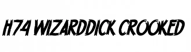
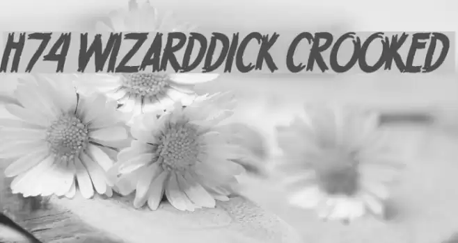
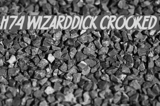
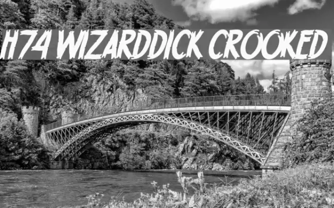
H74 WizardDick Crooked Font
H74 WizardDick Crooked Description
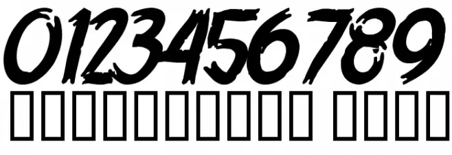
This font features a bold and dynamic style with a hand-drawn appearance. The characters are slightly slanted, giving a sense of movement and energy. The strokes are thick and uneven, adding a rugged and edgy feel. The uppercase and lowercase letters maintain a consistent style, with the uppercase being more pronounced. The numbers and special characters follow the same bold and expressive design, making them stand out. This font is perfect for projects that require a strong and impactful visual presence.
A bold, dynamic font with a hand-drawn, energetic style from Uncategorized fonts.
- Downloads: 841
- ( Fonts by www.legacyofdefeat.com FREE )
- H74WDC__.TTF
- Font: H74 WizardDick Crooked
- Weight: Crooked
- Version: Version Fontographer 4.7 6/30/11 FG4M0000020070
- No. of Characters:: 67
- Proposed Projects: Ideal for posters, album covers, graffiti art, and branding that requires a bold statement.
- Category:
- Bold: Yes
- Italic: No
- Weight: Bold
- Width: Normal
- Character Spacing: Normal
- Contrast: High
- Overall Style: Modern, Edgy
- Use Case: Headlines, Logos, Posters
- Encoding Scheme:
- Is Fixed Pitch: No
Glyphs 0 1 2 3 4 5 6 7 8 9 A B C D E F G H I J K L M N O P Q R S T U V W X Y Z a b c d e f g h i j k l m n o p q r s t u v w x y z
H74 WizardDick Crooked UPPERCASE
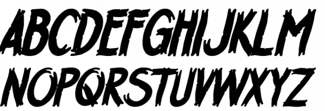
H74 WizardDick Crooked LOWERCASE

H74 WizardDick Crooked OTHER CHARS
Gallery Examples
Commercial Fonts Fonts
-
 Buy font H74 Le Venom Commercial Fonts
 -
 Buy font H74 Black Label Whiskey Commercial Fonts
 -
 Buy font H74 Black Mass Commercial Fonts