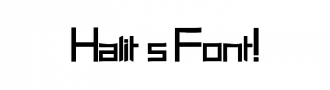
Halit's Font! Font
Halit's Font! Description
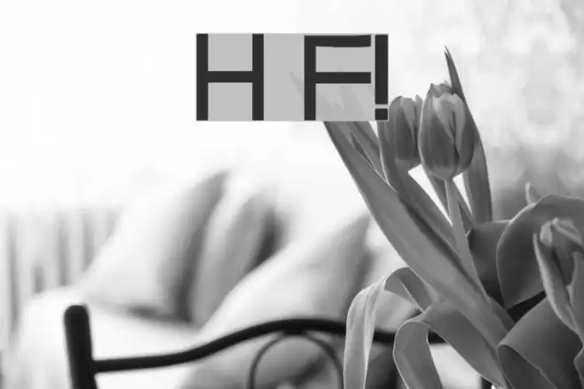
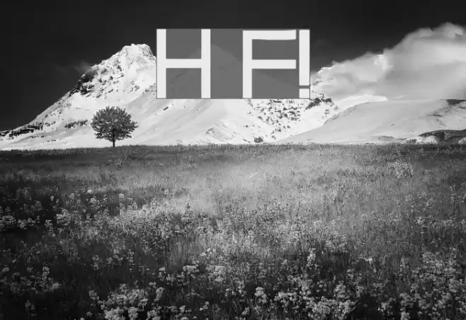
This font features a unique, geometric design with sharp angles and a modern aesthetic. The uppercase and lowercase letters maintain a consistent height, creating a uniform appearance. The characters are slightly condensed, giving a compact feel. The numerals and special characters follow the same angular style, adding to the cohesive look. The font's distinct style makes it suitable for attention-grabbing designs, while its clear readability ensures it remains functional.
A geometric, angular font with a modern and compact design from Uncategorized fonts.
- Downloads: 344
- Halit_s_Font_21.ttf
- Font: Halit's Font!
- Weight: Regular
- Version: Version Version 1.00 March 24, 2008, initial release
- No. of Characters:: 236
- Proposed Projects: Ideal for branding, posters, and digital media where a modern and distinctive look is desired.
- Category:
- Bold: No
- Italic: No
- Weight: Regular
- Width: Condensed
- Character Spacing: Normal
- Contrast: Low
- Overall Style: Modern
- Use Case: Headlines, Logos, Posters
- Encoding Scheme:
- Is Fixed Pitch: No
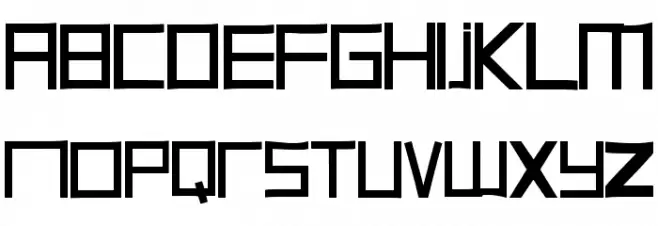
Glyphs ! # $ % ( ) * + , - . / 0 1 2 3 4 5 6 7 8 9 : ; = ? @ A B C D E F G H I J K L M N O P Q R S T U V W X Y Z [ ] ^ _
Halit's Font! UPPERCASE
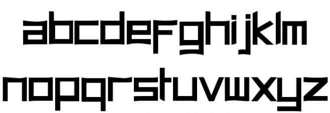
Halit's Font! LOWERCASE
Halit's Font! OTHER CHARS

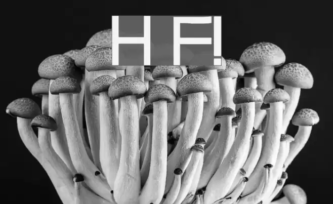
Gallery Examples
Download Free Fonts
Commercial Fonts Fonts
-
 Buy font Vintage Fonts Collection VFC Sufler Press Commercial Fonts
 -
 Buy font Vintage Fonts Collection VFC Sufler Commercial Fonts
 -
 Buy font Tri-Font Triangle Commercial Fonts