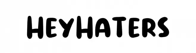
Hey Haters Font
Hey Haters Description
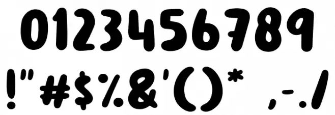
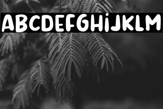
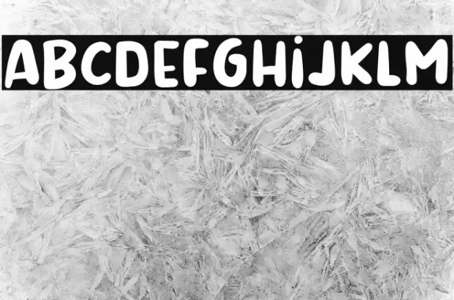
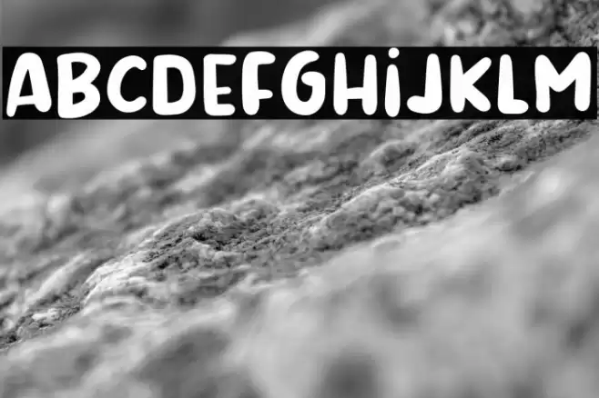
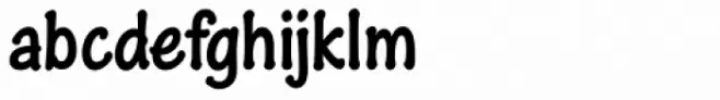
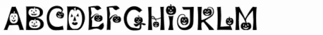
This playful and bold font features rounded, thick strokes that give it a friendly and approachable appearance. The characters are slightly irregular, adding a hand-drawn, whimsical feel. The uppercase and lowercase letters maintain a consistent style, with a slightly exaggerated width that enhances readability. Numbers and special characters are designed with the same playful aesthetic, making them suitable for a variety of creative projects. The overall design is modern yet casual, perfect for conveying a sense of fun and informality.
A playful, bold font with rounded, thick strokes and a hand-drawn feel from Cartoon fonts.
- Downloads: 347
- ( Fonts by Khurasan FREE )
- Hey Haters.otf
- Font: Hey Haters
- Weight:
- Version:
- No. of Characters:: over 20
- Proposed Projects: Ideal for children's books, playful branding, greeting cards, and social media graphics.
- Category:
- Bold: Yes
- Italic: No
- Weight: Bold
- Width: Expanded
- Character Spacing: Normal
- Contrast: Low
- Overall Style: Modern
- Use Case: Headlines, Logos
- Encoding Scheme:
- Is Fixed Pitch: No
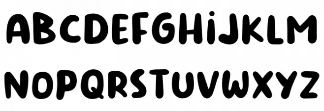
Glyphs
Hey Haters UPPERCASE
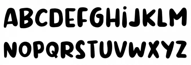
Hey Haters LOWERCASE
Hey Haters OTHER CHARS
Gallery Examples
Download
347 Downloads
-
 Buy font Hey Dude Commercial Fonts
 -
 Buy font Heywood Commercial Fonts
 -
 Buy font HeyPumpkin Commercial Fonts