Fonts
Human Error Upside Down Font
Description
- Human Error Upside Down.ttf
- Font: Human Error Upside Down
- Weight: Regular
- Version: Version 1.00 October 15, 2014, initial release
- No. of Characters:: 406
- Encoding Scheme:
- Is Fixed Pitch: 0
Welcome to the Font Trends page — your destination for discovering which fonts are shaping today’s design landscape. Whether you’re working on a brand refresh, social media visuals, or website UI, following current font trends helps your work feel fresh and relevant.
This collection features the most trending fonts of the season, chosen by designers and creators across the world. Expect to see elegant serifs, minimalist sans serifs, expressive display fonts, and handcrafted scripts that define modern aesthetics in 2025.
Combine your favorite trending typefaces with timeless categories like Modern, Serif, or Handwritten for a balanced and eye-catching design.
-
( Fonts by John David www.easywriter.com/fonts/ )
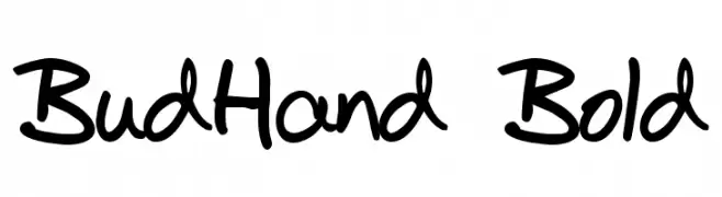
A bold, handwritten font with a casual and playful style.
 Download 2133 Downloads@WebFont
 -
![Zoeboxes Normal Free Fonts Download]() Download 185 Downloads@WebFont
Download 185 Downloads@WebFont -
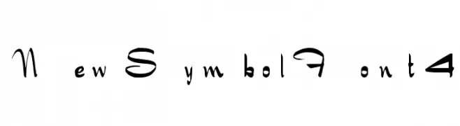
![NewSymbolFont4 Free Fonts Download]() Download 257 Downloads@WebFont
Download 257 Downloads@WebFont -
( Fonts by Jacob Fisher - www.pizzadude.dk )
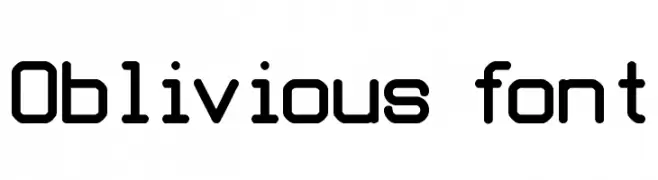
A modern, geometric font with rounded edges and monospaced characteristics.
![Oblivious font Free Fonts Download]() Download 3364 Downloads@WebFont
Download 3364 Downloads@WebFont -
![Terminus Free Fonts Download]() Download 2609 Downloads@WebFont
Download 2609 Downloads@WebFont -
( Fonts by Peter Stanton )
A whimsical and decorative font with playful embellishments and high contrast strokes.
![Bitchin Free Fonts Download]() Download 488 Downloads@WebFont
Download 488 Downloads@WebFont -
![Supra Genius Lines BRK Free Fonts Download]() Download 346 Downloads@WebFont
Download 346 Downloads@WebFont -
![Supra Genius Curves BRK Free Fonts Download]() Download 888 Downloads@WebFont
Download 888 Downloads@WebFont


FAQ — Font Trends
What are the current font trends?
Simplicity, legibility, and warmth dominate: rounded sans serifs, high-contrast serifs, and tasteful retro revivals are everywhere — clean but human.
Which fonts are trending in design right now?
Popular choices include BudHand Bold, Zoeboxes Normal, NewSymbolFont4, Oblivious font and Terminus — fonts known for their balance between modern and timeless. They look great on web pages, social content, and packaging, bringing a clean yet expressive feel.
How do I use trending fonts in my projects?
Use one standout display font for titles and pair it with a simple sans serif for body text. This creates contrast without losing readability. Always test how your chosen font trend performs across screen sizes and branding materials before finalizing.
💡 Tip: Refresh key assets every few months with a new trending font to keep visuals sharp and discoverable.