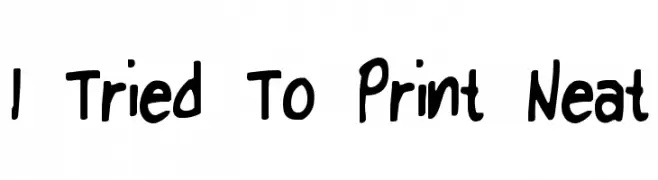
I Tried To Print Neat Font
I Tried To Print Neat Description
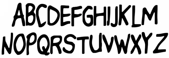
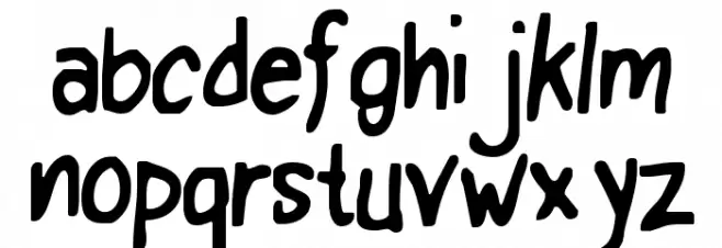
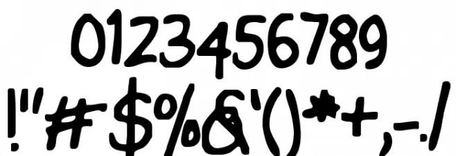
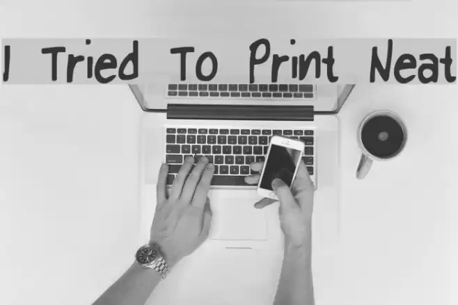
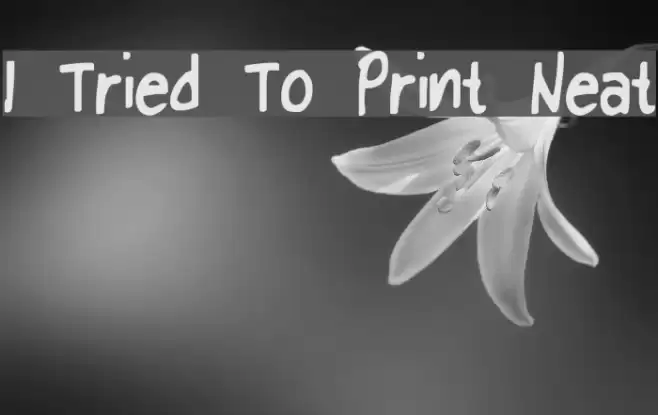
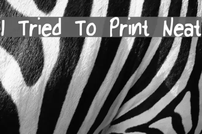
This font features a playful, handwritten style with a casual and informal appearance. The letters are bold and slightly uneven, giving them a whimsical and approachable feel. The uppercase and lowercase letters maintain a consistent style, with rounded edges and varying stroke widths that add to the font's charm. The numbers and special characters follow the same playful design, making the font versatile for creative projects. Its unique character spacing and irregular shapes make it stand out, perfect for designs that require a personal touch.
A playful, handwritten font with bold, uneven strokes and a whimsical feel from Uncategorized fonts.
- Downloads: 123
- ( Dry Heaves - www.drybohnz.com/ FREE )
- I Tried To Print Neat.ttf
- Font: I Tried To Print Neat
- Weight: I Tried To Print Neat
- Version: Version
- No. of Characters:: 96
- Proposed Projects: Ideal for children's books, greeting cards, playful branding, and casual invitations.
- Category:
- Bold: Yes
- Italic: No
- Weight: Bold
- Width: Normal
- Character Spacing: Normal
- Contrast: Medium
- Overall Style: Casual
- Use Case: Headlines, Logos, Informal Text
- Encoding Scheme:
- Is Fixed Pitch: No
Glyphs ! # $ % ( ) * + , - . / 0 1 2 3 4 5 6 7 8 9 : ; = ? @ A B C D E F G H I J K L M N O P Q R S T U V W X Y Z [ ] ^ _ ` a b c d e f g h i j k l m n o p q r s t u v w x y z { | } ~
I Tried To Print Neat UPPERCASE
I Tried To Print Neat LOWERCASE
I Tried To Print Neat OTHER CHARS
Gallery Examples
Download Free Fonts
-
 Buy font KG Neatly Printed Commercial Fonts
 -
 Buy font Neat Hand Lower Case Commercial Fonts
 -
 Buy font Neat Hand Small Caps Commercial Fonts