I'm Not Like Most Fonts Font
I'm Not Like Most Fonts Description
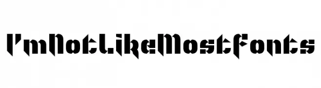
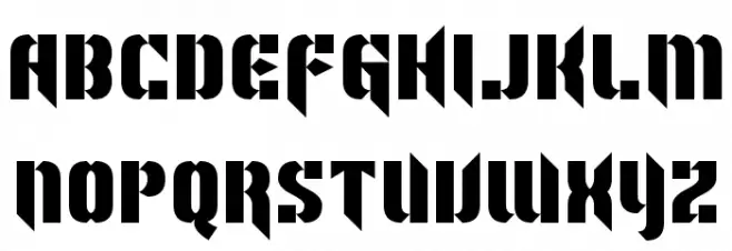
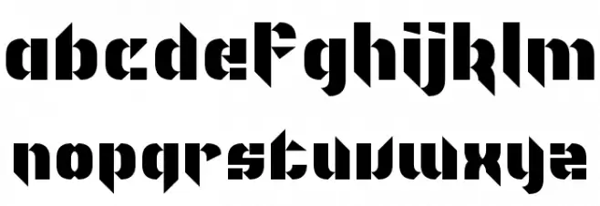
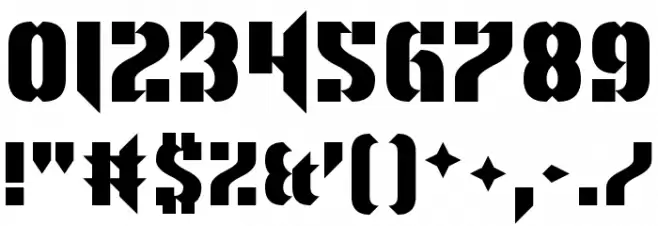
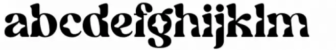
This font features a bold and striking design with a strong geometric influence. The characters are constructed with sharp angles and a blocky appearance, reminiscent of industrial or futuristic styles. The uppercase and lowercase letters maintain a consistent weight, contributing to a cohesive and powerful visual impact. The numbers and special characters follow the same design principles, ensuring uniformity across all glyphs. This font's unique aesthetic makes it suitable for projects that require a modern and edgy look.
A bold, geometric font with a futuristic and industrial style from Uncategorized fonts.
- Downloads: 80
- ( Fonts by www.chequered.ink - Chequered Ink - Personal-use only. For commercial use please contact owner. FREE )
- I'm Not Like Most Fonts.otf
- Font: I'm Not Like Most Fonts
- Weight: Regular
- Version: Version 1.00;October 23, 2017;FontCreator 11.0.0.2408 64-bit
- No. of Characters:: 98
- Proposed Projects: Ideal for branding, posters, album covers, and any design needing a modern, edgy touch.
- Category:
- Bold: Yes
- Italic: No
- Weight: Bold
- Width: Normal
- Character Spacing: Normal
- Contrast: Low
- Overall Style: Modern
- Use Case: Headlines, Logos
- Encoding Scheme:
- Is Fixed Pitch: No
Glyphs ! # $ % ( ) * + , - . / 0 1 2 3 4 5 6 7 8 9 : ; = ? @ A B C D E F G H I J K L M N O P Q R S T U V W X Y Z [ ] ^ _ ` a b c d e f g h i j k l m n o p q r s t u v w x y z { | } ~ ;
I'm Not Like Most Fonts UPPERCASE
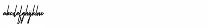
I'm Not Like Most Fonts LOWERCASE
I'm Not Like Most Fonts OTHER CHARS
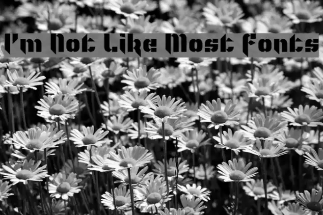
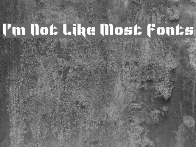
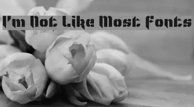
Gallery Examples
Download Free Fonts
Commercial Fonts Fonts
-
 Buy font Mostaza Regular Commercial Fonts
 -
 Buy font Mostera Regular Commercial Fonts
 -
 Buy font West Most Regular Commercial Fonts