Free Fonts Decorative/Display
InterZone 2 Font

Do you have the right license?
Having the right license means that you protect yourself from negative legal consequences of not getting proper permissions. Make sure you have the right license by purchasing the individual font or to use a tool like Envato where all fonts are commercially licensed automatically.
General information
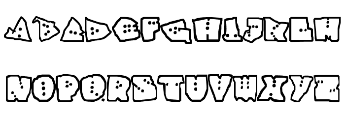
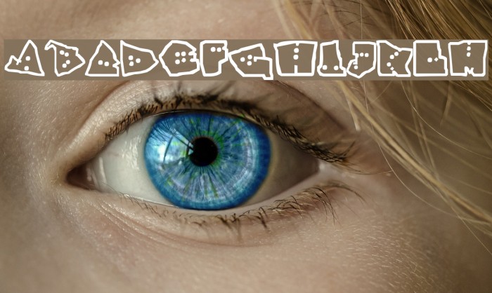
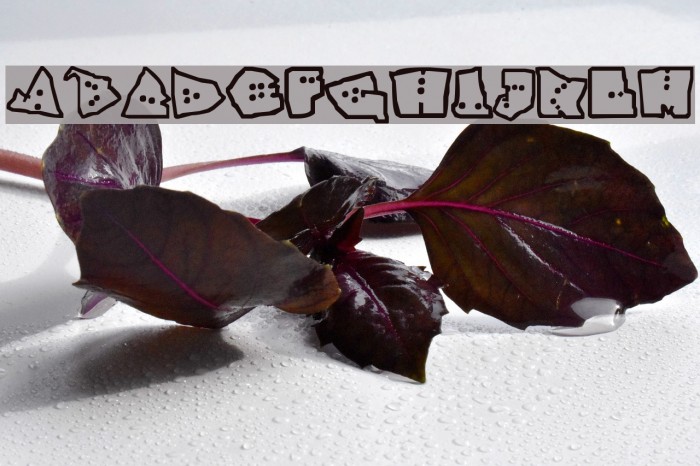
This font features a playful and quirky design with a bold, cartoonish style. Each letter is uniquely shaped with irregular outlines and filled with small dots, giving it a whimsical and fun appearance. The characters are bold and chunky, making them stand out with a strong presence. The font lacks lowercase letters, numbers, and special characters, focusing solely on uppercase letters. Its distinctive style is reminiscent of comic books or children's illustrations, making it ideal for projects that require a lighthearted and informal tone.
A playful, bold, and cartoonish font with irregular outlines and dot patterns.
- Downloads: 141
- interzon.ttf
- Font: InterZone 2
- Weight: Future Style
- Version: Version senile_98@yahoo.com
- No. of Characters:: 29
- Proposed Projects: Ideal for children's books, comic strips, playful posters, and informal event invitations.
- Category: Decorative/Display
- Bold: Yes
- Italic: No
- Weight: Bold
- Width: Normal
- Character Spacing: Normal
- Contrast: Low
- Overall Style: Playful, Cartoonish
- Use Case: Headlines, Posters, Children's materials
- Encoding Scheme:
- Is Fixed Pitch: No
Glyphs . A B C D E F G H I J K L M N O P Q R S T U V W X Y Z
UPPERCASE
LOWERCASE

OTHER CHARS

Gallery Examples

Download Free Fonts
-
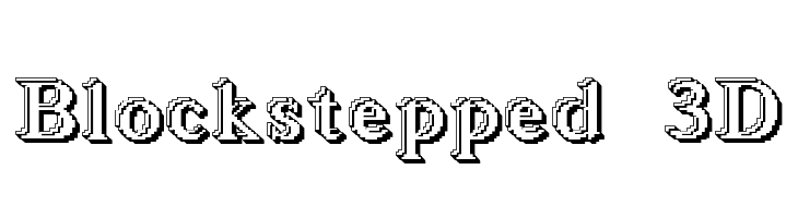
 Blockstepped 3D Download Blockstepped 3D
 -
SF Florencesans SC Shaded Download SF Florencesans SC Shaded

Commercial Fonts Fonts
-
-
Lettrines Petin Ornee Download Lettrines Petin Ornee
Similar free fonts for Lettrines Petin Ornee font


Fonts Commercial Fonts
-
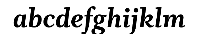
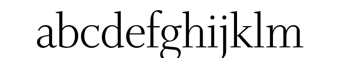
Buy font Whitman Extra Bold Commercial Fonts
-
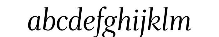
Buy font Whitman Extra Bold Italic Commercial Fonts
-
Buy font Whitman Extra Bold Italic Commercial Fonts
-
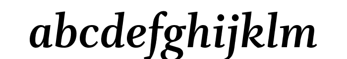
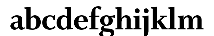
Buy font Whitman Bold Commercial Fonts
-
Buy font Whitman Bold Commercial Fonts
-
Buy font Whitman Bold Italic Commercial Fonts
-
Buy font Whitman Bold Italic Commercial Fonts
-
Buy font Whitman Black Commercial Fonts
-
Buy font Whitman Black Commercial Fonts
-
Buy font Whitman Display Semi Bold Commercial Fonts
-
Buy font Whitman Display Semi Bold Commercial Fonts
-
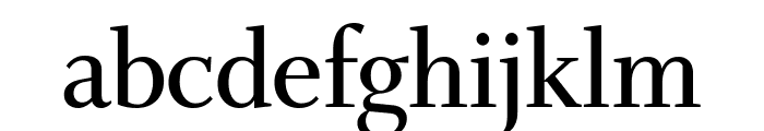
Buy font Whitman Display Regular Commercial Fonts
-
Buy font Whitman Display Regular Commercial Fonts
-
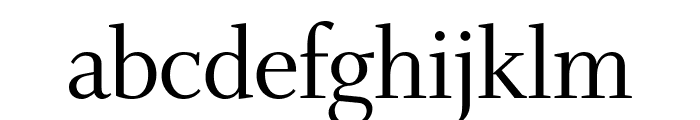
Buy font Whitman Display Light Commercial Fonts
-
Buy font Whitman Display Light Commercial Fonts
-
Buy font Whitman Display Italic Commercial Fonts
-
Buy font Whitman Display Italic Commercial Fonts
-
Buy font Whitman Display Extra Bold Commercial Fonts