Japers Font

Japers Description
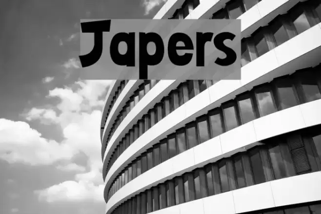
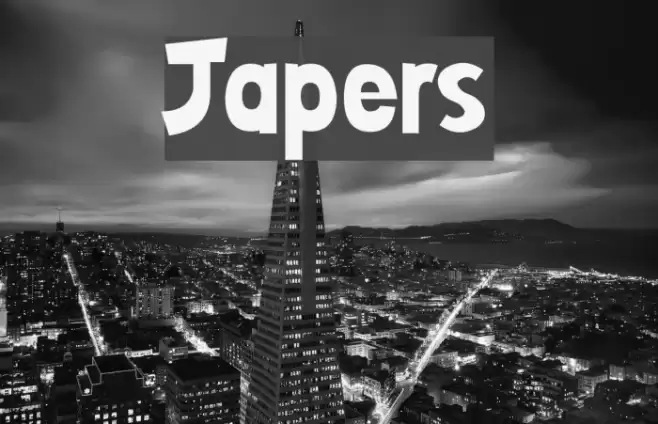
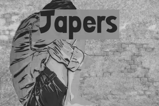
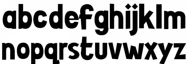
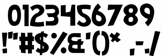
This font features a bold and playful design with a slightly irregular and whimsical appearance. The characters are thick and robust, giving a strong visual impact. The uppercase and lowercase letters maintain a consistent style, with a slight tilt and uneven baseline that adds to its quirky charm. The numbers and special characters follow the same playful aesthetic, making it suitable for creative and informal applications. The overall look is eye-catching and dynamic, perfect for grabbing attention.
A bold, playful font with a whimsical and dynamic style from Cartoon fonts.
- Downloads: 382
- ( Fonts by Chequered Ink FREE )
- Japers.otf
- Font: Japers
- Weight: Regular
- Version: Version 1.00 March 3, 2016, initial release
- No. of Characters:: 190
- Proposed Projects: Ideal for children's books, playful branding, posters, and creative advertising.
- Category:
- Bold: Yes
- Italic: No
- Weight: Bold
- Width: Normal
- Character Spacing: Normal
- Contrast: Low
- Overall Style: Playful, Quirky, Dynamic
- Use Case: Headlines, Posters, Branding
- Encoding Scheme:
- Is Fixed Pitch: No
Glyphs ! # $ % ( ) * + , - . / 0 1 2 3 4 5 6 7 8 9 : ; = ? @ A B C D E F G H I J K L M N O P Q R S T U V W X Y Z [ ] ^ _ ` a b c d e f g h i j k l m n o p q r s t u v w x y z { | } ~ ı ˇ ˚ ; ₣ ₤ ₧ №
Japers UPPERCASE
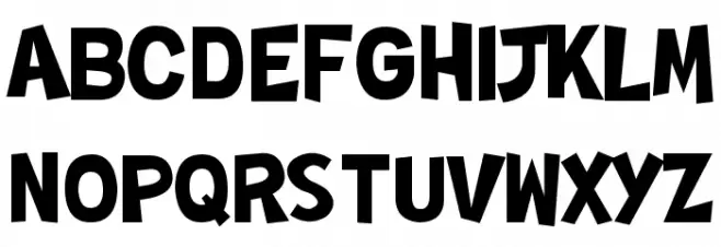
Japers LOWERCASE
Japers OTHER CHARS
Gallery Examples