Japon Font

Japon Description
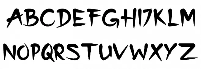
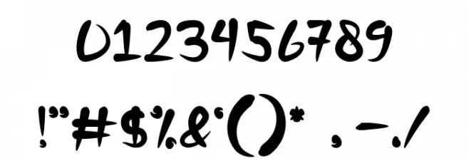
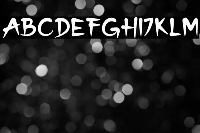
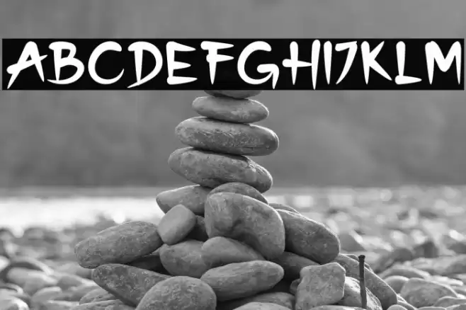
This font features a bold and dynamic style with sharp, angular strokes that give it a sense of movement and energy. The characters are slightly slanted, adding a touch of informality and playfulness. The uppercase and lowercase letters maintain a consistent style, with exaggerated curves and pointed ends that create a unique and memorable appearance. The numbers and special characters follow the same design principles, ensuring a cohesive look across all elements. This font is ideal for projects that require a bold statement and a touch of creativity.
A bold, dynamic font with sharp, angular strokes and a playful slant from Uncategorized fonts.
- Downloads: 53
- ( Fonts by Sambogo Creative - Personal-use only. For commercial use please contact owner. FREE )
- Font: Japon
- Weight:
- Version:
- No. of Characters:: over 20
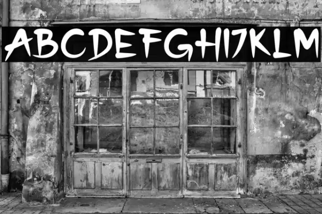
- Proposed Projects: Perfect for branding, posters, headlines, and any design needing a bold, energetic touch.
- Category:
- Bold: Yes
- Italic: No
- Weight: Bold
- Width: Normal
- Character Spacing: Normal
- Contrast: High
- Overall Style: Modern
- Use Case: Headlines, Logos, Posters
- Encoding Scheme:
- Is Fixed Pitch: No
Glyphs
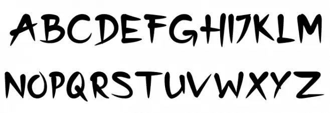
Japon UPPERCASE
Japon LOWERCASE
Japon OTHER CHARS
Gallery Examples
Download
53 Downloads
-
 Buy font European Soft Pro Medium Italic Commercial Fonts
 -
 Buy font European Soft Pro Bold Commercial Fonts
 -
 Buy font European Soft Pro Bold Italic Commercial Fonts