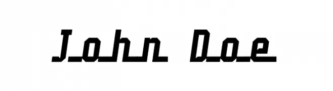
John Doe Font
John Doe Description
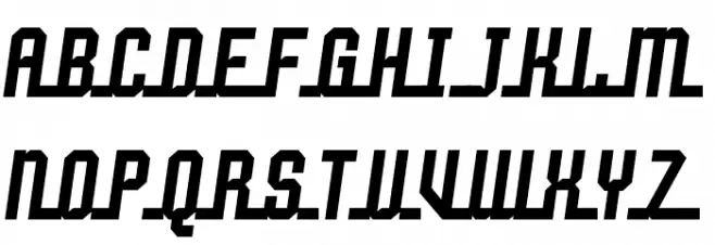
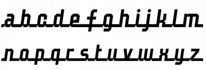
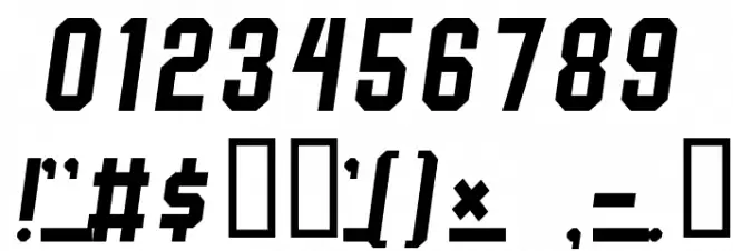
This font features a bold, angular design with a distinct slant, giving it a dynamic and energetic appearance. The uppercase letters are blocky and geometric, while the lowercase letters maintain a similar angular style with a slightly more condensed form. The numbers are consistent with the overall bold and angular theme, providing a cohesive look across all characters. The special characters are designed to match the boldness and angularity of the letters and numbers, ensuring uniformity throughout the font. This style is reminiscent of retro or vintage sports typography, making it ideal for projects that require a strong, impactful visual presence.
A bold, angular font with a dynamic slant, ideal for impactful designs from Script fonts.
- Downloads: 2,907
- ( Fonts by Jacob Fisher - www.pizzadude.dk FREE )
- Johndoe.ttf
- Font: John Doe
- Weight: Regular
- Version: Version www.pizzadude.dk
- No. of Characters:: 100
- Proposed Projects: This font is perfect for sports branding, retro-themed posters, dynamic logos, and any design requiring a bold statement.
- Category:
- Bold: Yes
- Italic: No
- Weight: Bold
- Width: Normal
- Character Spacing: Normal
- Contrast: Medium
- Overall Style: Retro, Dynamic
- Use Case: Headlines, Logos, Posters
- Encoding Scheme:
- Is Fixed Pitch: No
Glyphs ! # $ ( ) * + , - . 0 1 2 3 4 5 6 7 8 9 : ; = ? @ A B C D E F G H I J K L M N O P Q R S T U V W X Y Z [ ] _ ` a b c d e f g h i j k l m n o p q r s t u v w x y z { | }
John Doe UPPERCASE
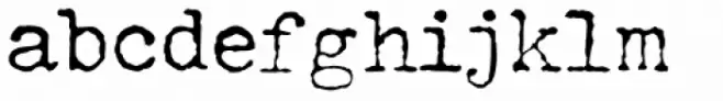
John Doe LOWERCASE
John Doe OTHER CHARS
Gallery Examples


Download Free Fonts
Commercial Fonts Fonts
-
 Buy font John Doe Commercial Fonts
 -
 Buy font Architype Van Doesburg Commercial Fonts
 -
 Buy font Doedel Swash Commercial Fonts