Jonze & Jonzing Font

Jonze & Jonzing Description
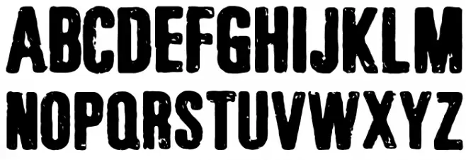
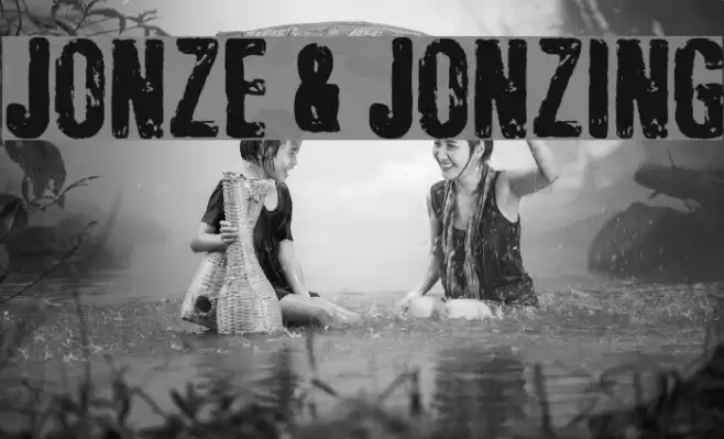
This font features a bold, distressed style with a rugged, textured appearance. The characters are uppercase and lowercase with a consistent, heavy weight that gives them a strong presence. The rough edges and uneven surfaces create a vintage, grunge aesthetic, making it ideal for designs that require a raw, edgy look. The numerals and special characters maintain the same distressed quality, ensuring a cohesive appearance across all text elements. This font is perfect for projects that aim to convey a sense of toughness or rebellion.
A bold, distressed font with a rugged, textured appearance from Distorted Eroded fonts.
- Downloads: 2,012
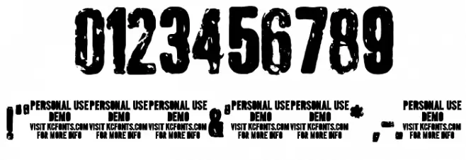
- ( Fonts by Kevin Christopher - www.kcfonts.com. Personal-use only. For commercial use please contact owner. FREE )
- Jonze&JonzingDEMO-KCFonts.ttf
- Font: Jonze & Jonzing
- Weight: Regular
- Version: Version 1.000 DEMO
- No. of Characters:: 120
- Proposed Projects: Ideal for posters, album covers, branding for edgy products, or any design needing a vintage, grunge aesthetic.
- Category:
- Bold: Yes
- Italic: No
- Weight: Bold
- Width: Normal
- Character Spacing: Normal
- Contrast: Low
- Overall Style: Vintage
- Use Case: Headlines, Logos, Posters
- Encoding Scheme:
- Is Fixed Pitch: No
Glyphs ! # $ % ( ) * + , - . / 0 1 2 3 4 5 6 7 8 9 : ; = ? @ A B C D E F G H I J K L M N O P Q R S T U V W X Y Z [ ] ^ a b c d e f g h i j k l m n o p q r s t u v w x y z { | } ~
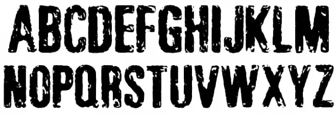
Jonze & Jonzing UPPERCASE
Jonze & Jonzing LOWERCASE
Jonze & Jonzing OTHER CHARS
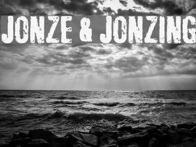
Gallery Examples

Download Free Fonts
Commercial Fonts Fonts
-
 Buy font Jonze Commercial Fonts
 -
 Buy font Jonze Italic Commercial Fonts
 -
 Buy font Jonzing Italic Commercial Fonts