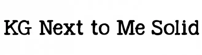
KG Next to Me Solid Font
KG Next to Me Solid Description
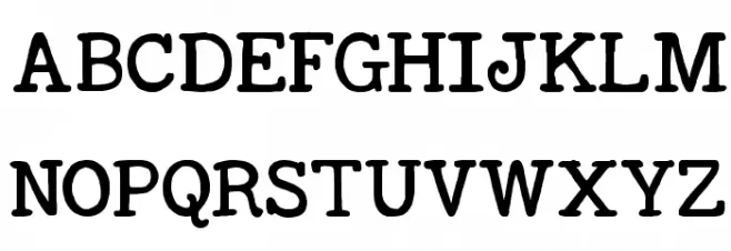
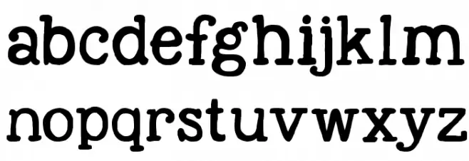
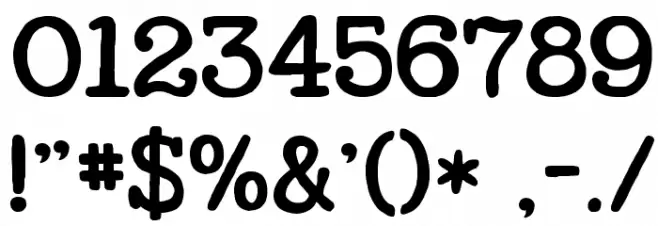
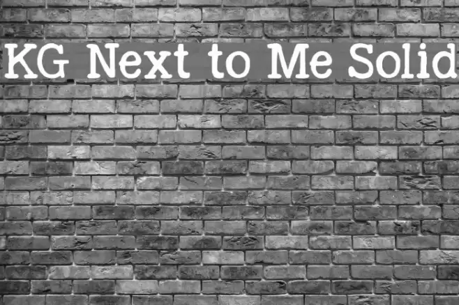
This font features a playful and rounded style with a touch of whimsy. The characters are bold and have a slightly uneven baseline, giving them a hand-drawn appearance. The strokes are consistent in thickness, providing a uniform look across all characters. The uppercase letters are slightly larger than the lowercase, maintaining a good balance. The numbers and special characters follow the same design, ensuring cohesiveness throughout. This font is ideal for projects that require a friendly and approachable feel.
A playful, rounded font with a hand-drawn appearance from Uncategorized fonts.
- Downloads: 618
- ( Fonts by www.kimberlygeswein.com - Kimberly Geswein FREE )
- KGNexttoMeSolid.ttf
- Font: KG Next to Me Solid
- Weight: Regular
- Version: Version Version 1.000 2013 initial release
- No. of Characters:: 330
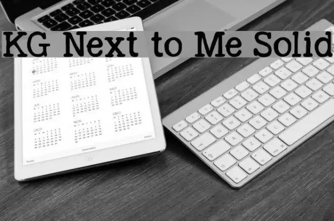
- Proposed Projects: Ideal for children's books, playful branding, greeting cards, and informal invitations.
- Category:
- Bold: Yes
- Italic: No
- Weight: Bold
- Width: Normal
- Character Spacing: Normal
- Contrast: Low
- Overall Style: Playful
- Use Case: Headlines, Logos, Informal Text
- Encoding Scheme:
- Is Fixed Pitch: No
Glyphs ! # $ % ( ) * + , - . / 0 1 2 3 4 5 6 7 8 9 : ; = ? @ A B C D E F G H I J K L M N O P Q R S T U V W X Y Z [ ] ^ _ ` a b c d e f g h i j k l m n o p q r s t u v w x y z { | } ~
KG Next to Me Solid UPPERCASE
KG Next to Me Solid LOWERCASE
KG Next to Me Solid OTHER CHARS
Gallery Examples

Download Free Fonts
Commercial Fonts Fonts
-
 Buy font Architype Catalogue Solid Commercial Fonts
 -
 Buy font Asbury Park Solid Oblique JNL Commercial Fonts
 -
 Buy font Asbury Park Solid JNL Commercial Fonts