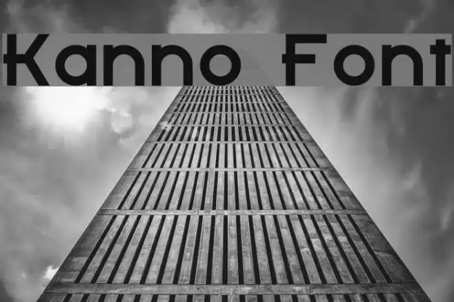
Kanno Font

Kanno Description
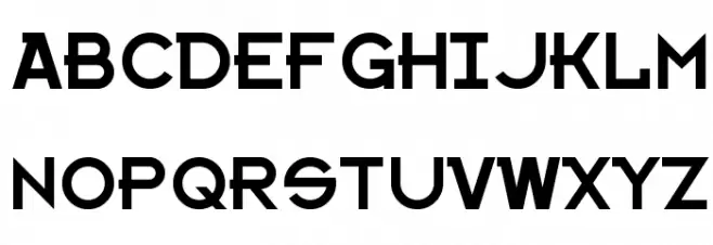
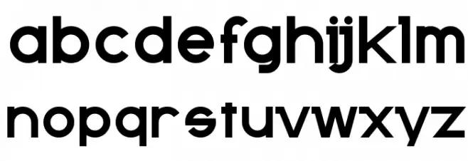
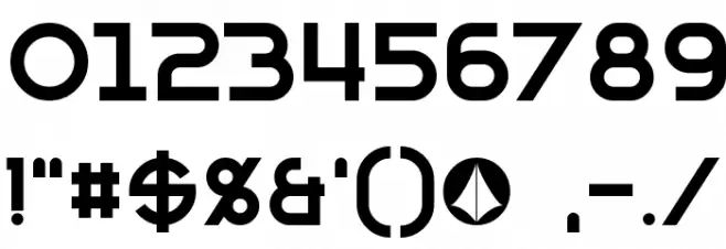
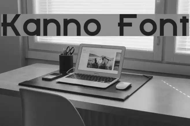
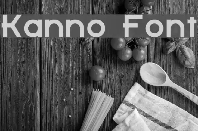
This font features a bold and modern design with geometric influences. The uppercase letters are uniform in height, with a consistent stroke width that gives a clean and structured appearance. The lowercase letters maintain a similar geometric style, with rounded edges that add a touch of softness to the overall look. The numbers are clear and legible, designed to match the boldness of the alphabet characters. Special characters are included, maintaining the same geometric and bold style, ensuring consistency across all glyphs. This font is ideal for projects that require a modern and impactful visual presence.
A bold, geometric font with a modern and structured design from Uncategorized fonts.
- Downloads: 520
- ( Fonts by a Neale Davidson - www.pixelsagas.com. Personal-use only. For commercial use please contact owner. FREE )
- Kanno.otf
- Font: Kanno
- Weight: Regular
- Version: Version 1.50 January 9, 2014
- No. of Characters:: 236
- Proposed Projects: Ideal for branding, advertising, headlines, and digital media projects that require a strong visual impact.
- Category:
- Bold: Yes
- Italic: No
- Weight: Bold
- Width: Normal
- Character Spacing: Normal
- Contrast: Low
- Overall Style: Modern
- Use Case: Headlines, Logos, Branding
- Encoding Scheme:
- Is Fixed Pitch: No
Glyphs ! # $ % ( ) * + , - . / 0 1 2 3 4 5 6 7 8 9 : ; = ? @ A B C D E F G H I J K L M N O P Q R S T U V W X Y Z [ ] ^ _ ` a b c d e f g h i j k l m n o p q r s t u v w x y z { | } ~ ı ˇ ˉ ˘ ˙ ˚ ˛ ˝ ; ₣ ₤ ₧ № ∆ ∕ ∙ fi fl
Kanno UPPERCASE
Kanno LOWERCASE
Kanno OTHER CHARS
Gallery Examples
Download Free Fonts
Commercial Fonts Fonts
-
 Buy font Bentband Light Commercial Fonts
 -
 Buy font Bentband Regular Commercial Fonts
 -
 Buy font Bentband Medium Commercial Fonts