Fonts
King Font
Description
- KIN668.TTF
- Font: King
- Weight: Regular
- Version: Version
- No. of Characters:: 399
- Encoding Scheme:
- Is Fixed Pitch: 0
Welcome to the Font Trends page — your destination for discovering which fonts are shaping today’s design landscape. Whether you’re working on a brand refresh, social media visuals, or website UI, following current font trends helps your work feel fresh and relevant.
This collection features the most trending fonts of the season, chosen by designers and creators across the world. Expect to see elegant serifs, minimalist sans serifs, expressive display fonts, and handcrafted scripts that define modern aesthetics in 2025.
Combine your favorite trending typefaces with timeless categories like Modern, Serif, or Handwritten for a balanced and eye-catching design.
-
( Fonts by Divide By Zero! - fonts.tom7.com )
A playful, bold font with rounded edges and a hand-drawn feel.
 Download 1277 Downloads@WebFont
 -
( Fonts by Rich Gast - www.greywolfwebworks.com Commercial Fonts Font )
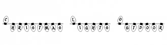
A festive font styled like Christmas lights, perfect for holiday themes.
![Christmas Lights Outdoor Free Fonts Download]() Download 153 Downloads
Download 153 Downloads -
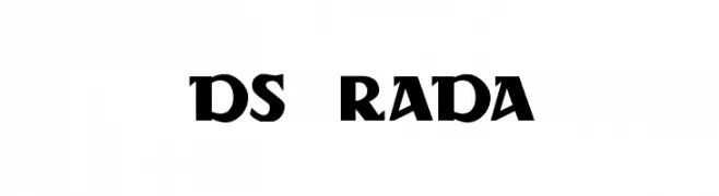
![DS Rada Free Fonts Download]() Download 343 Downloads@WebFont
Download 343 Downloads@WebFont -
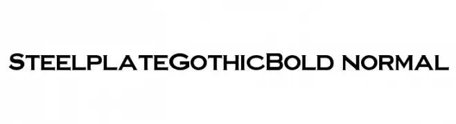
![SteelplateGothicBold normal Free Fonts Download]() Download 2448 Downloads
Download 2448 Downloads -
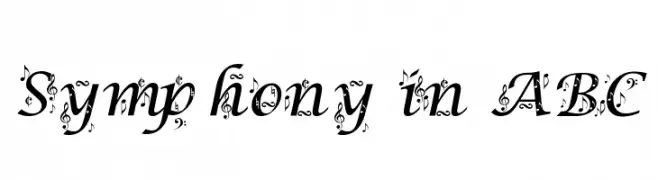
![Symphony in ABC Free Fonts Download]() Download 1605 Downloads
Download 1605 Downloads -
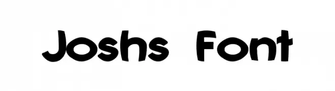
( Fonts by Graham Meade - GemFonts )
A playful, bold font with rounded edges and a whimsical style.
![Joshs Font Free Fonts Download]() Download 348 Downloads@WebFont
Download 348 Downloads@WebFont -
( Fonts by Nick Curtis - www.nicksfonts.com )
A playful and whimsical collection of bold, graphic symbols.
![DecoDingbats1 Free Fonts Download]() Download 244 Downloads
Download 244 Downloads -
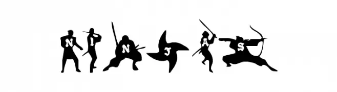
( Fonts by Daniel Zadorozny - www.iconian.com )
A dynamic, ninja-themed decorative font with action-packed silhouettes.
![Ninjas Free Fonts Download]() Download 678 Downloads
Download 678 Downloads

FAQ — Font Trends
What are the current font trends?
Simplicity, legibility, and warmth dominate: rounded sans serifs, high-contrast serifs, and tasteful retro revivals are everywhere — clean but human.
Which fonts are trending in design right now?
Popular choices include Epilog, Christmas Lights Outdoor, DS Rada, SteelplateGothicBold normal and Symphony in ABC — fonts known for their balance between modern and timeless. They look great on web pages, social content, and packaging, bringing a clean yet expressive feel.
How do I use trending fonts in my projects?
Use one standout display font for titles and pair it with a simple sans serif for body text. This creates contrast without losing readability. Always test how your chosen font trend performs across screen sizes and branding materials before finalizing.
💡 Tip: Refresh key assets every few months with a new trending font to keep visuals sharp and discoverable.