Komika Display Kaps Bold Font

Komika Display Kaps Bold Description
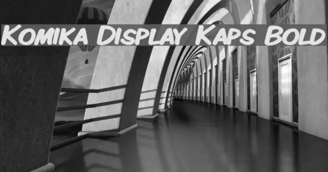
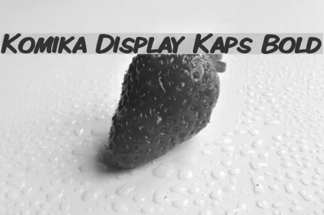
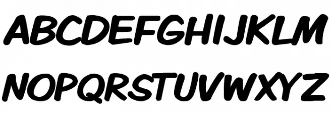
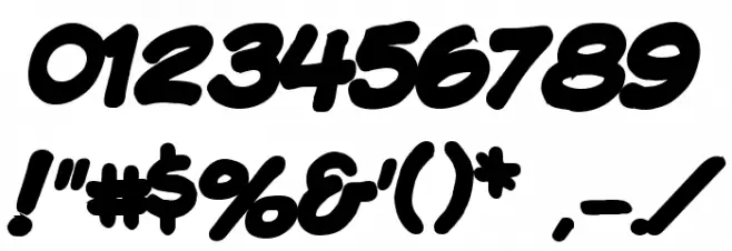
This font features bold, rounded characters with a playful and energetic style. The letters are slightly slanted, giving a sense of motion and dynamism. The strokes are thick and consistent, contributing to a strong visual impact. The overall appearance is friendly and approachable, making it suitable for informal and fun contexts. The numerals and special characters maintain the same bold and rounded style, ensuring consistency across all glyphs.
A bold, rounded, and playful font with a dynamic slant from Comic fonts.
- Downloads: 943
- ( Fonts by Apostrophic Lab FREE )
- KMKDSPKB.ttf
- Font: Komika Display Kaps Bold
- Weight: Bold
- Version: Version 2.0
- No. of Characters:: 225
- Proposed Projects: Ideal for comic books, children's books, playful branding, and casual posters.
- Category:
- Bold: Yes
- Italic: No
- Weight: Bold
- Width: Normal
- Character Spacing: Normal
- Contrast: Low
- Overall Style: Playful and Energetic
- Use Case: Headlines, Logos, Posters
- Encoding Scheme:
- Is Fixed Pitch: No
Glyphs ! # $ % ( ) * + , - . / 0 1 2 3 4 5 6 7 8 9 : ; = ? @ A B C D E F G H I J K L M N O P Q R S T U V W X Y Z [ ] ^ _ ` a b c d e f g h i j k l m n o p q r s t u v w x y z { | } ~
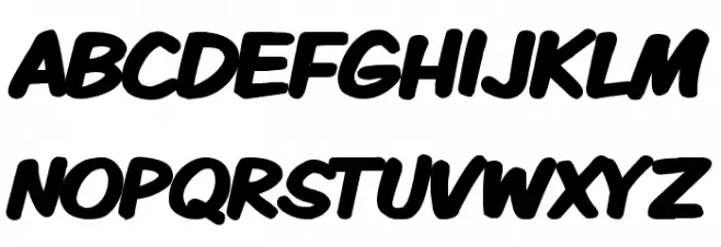
Komika Display Kaps Bold UPPERCASE
Komika Display Kaps Bold LOWERCASE
Komika Display Kaps Bold OTHER CHARS
Gallery Examples