Komika Display Kaps Wide Font

Komika Display Kaps Wide Description
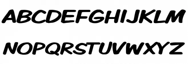
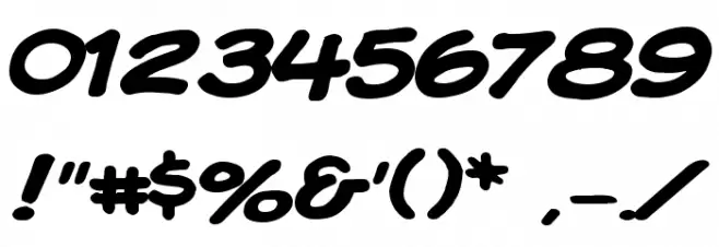
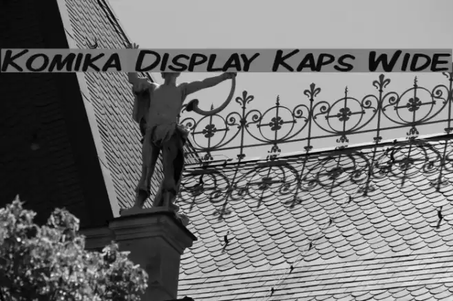
This font features a playful and bold style with a handwritten appearance, characterized by its wide and rounded letterforms. The strokes are thick and consistent, giving it a strong presence. The uppercase letters are slightly slanted, adding a dynamic feel, while the lowercase letters maintain a similar style, ensuring uniformity. The numbers and special characters follow the same design principles, making the font versatile for various uses. Its informal and friendly look makes it suitable for projects that require a casual and approachable tone.
A bold, playful font with a handwritten style and wide, rounded letters from Comic fonts.
- Downloads: 506
- ( Fonts by Apostrophic Lab FREE )
- KMKDSPKW.ttf
- Font: Komika Display Kaps Wide
- Weight: Regular
- Version: Version 2.0
- No. of Characters:: 225
- Proposed Projects: Ideal for comic books, children's books, playful branding, and informal posters.
- Category:
- Bold: Yes
- Italic: No
- Weight: Bold
- Width: Expanded
- Character Spacing: Normal
- Contrast: Low
- Overall Style: Playful
- Use Case: Headlines, Logos, Posters
- Encoding Scheme:
- Is Fixed Pitch: No
Glyphs ! # $ % ( ) * + , - . / 0 1 2 3 4 5 6 7 8 9 : ; = ? @ A B C D E F G H I J K L M N O P Q R S T U V W X Y Z [ ] ^ _ ` a b c d e f g h i j k l m n o p q r s t u v w x y z { | } ~
Komika Display Kaps Wide UPPERCASE

Komika Display Kaps Wide LOWERCASE
Komika Display Kaps Wide OTHER CHARS
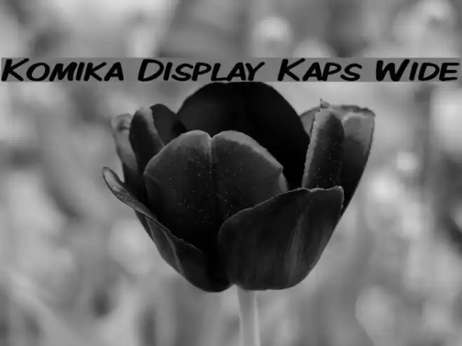
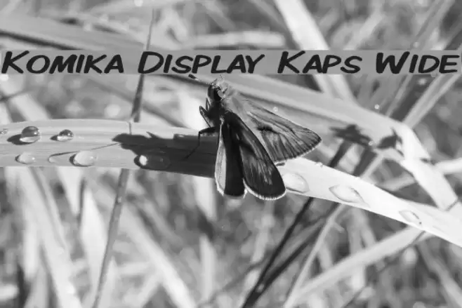
Gallery Examples
Download Free Fonts
Commercial Fonts Fonts
-
 Buy font Bottle Kaps Commercial Fonts
 -
 Buy font Bottle Kaps Italic Commercial Fonts
 -
 Buy font Bottle Kaps Condensed Commercial Fonts