Komika Display Tight Font

Komika Display Tight Description
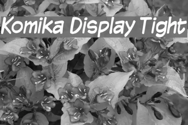
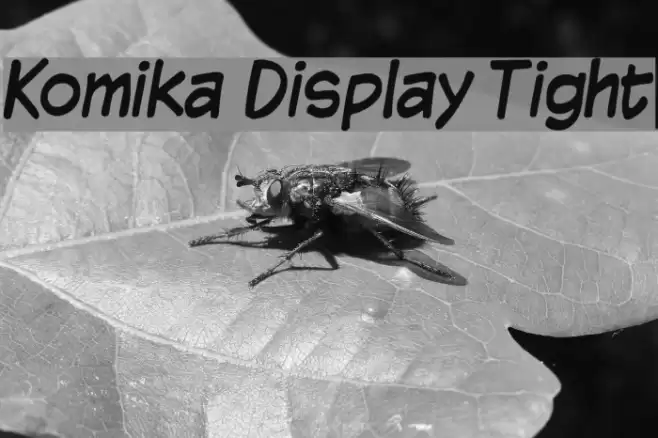
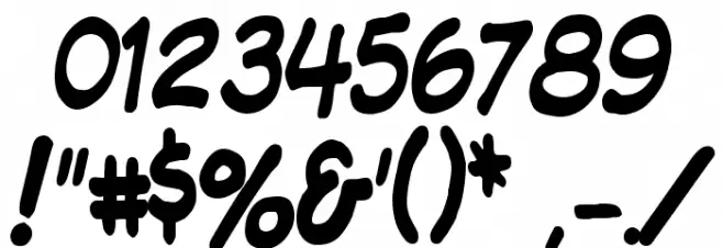
This playful and bold font features a hand-drawn, comic-inspired style with rounded edges and a casual feel. The letters are slightly slanted, giving a dynamic and energetic appearance. The uppercase and lowercase characters maintain a consistent style, with a slightly exaggerated, cartoonish look. The numbers and special characters follow the same playful design, making the font versatile for creative projects. Its thick strokes and rounded forms make it highly legible, even at smaller sizes, while the tight spacing between characters adds to its compact and cohesive look.
A playful, comic-inspired font with bold, rounded characters and tight spacing from Comic fonts.
- Downloads: 1,277
- ( Fonts by Apostrophic Lab FREE )
- KMKDSPT_.ttf
- Font: Komika Display Tight
- Weight: Regular
- Version: Version 2.0
- No. of Characters:: 227
- Proposed Projects: Ideal for comic books, children's books, playful branding, posters, and social media graphics.
- Category:
- Bold: Yes
- Italic: No
- Weight: Bold
- Width: Normal
- Character Spacing: Tight
- Contrast: Low
- Overall Style: Playful, Comic
- Use Case: Headlines, Logos, Posters
- Encoding Scheme:
- Is Fixed Pitch: No
Glyphs ! # $ % ( ) * + , - . / 0 1 2 3 4 5 6 7 8 9 : ; = ? @ A B C D E F G H I J K L M N O P Q R S T U V W X Y Z [ ] ^ _ ` a b c d e f g h i j k l m n o p q r s t u v w x y z { | } ~
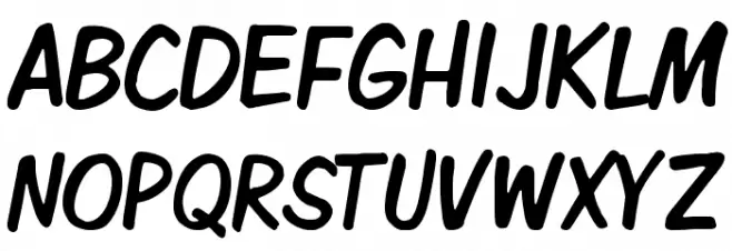
Komika Display Tight UPPERCASE
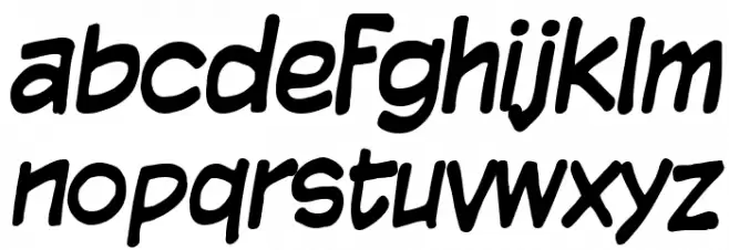
Komika Display Tight LOWERCASE
Komika Display Tight OTHER CHARS
Gallery Examples