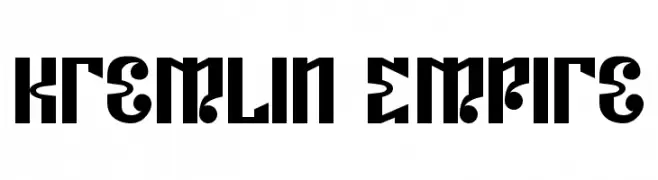
Kremlin Empire Font
Kremlin Empire Description
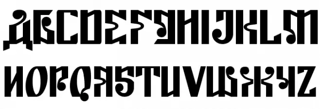
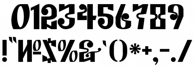
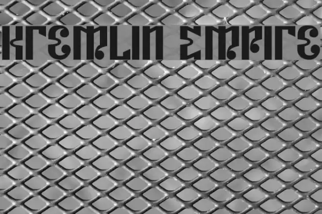
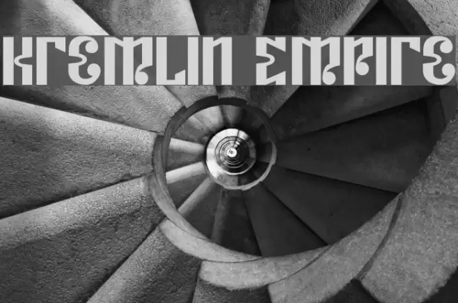
This font features a bold and striking design with a strong geometric influence. The characters are constructed with sharp angles and distinct cuts, giving them a unique and modern appearance. The uppercase letters are particularly prominent, with a sense of symmetry and balance that adds to their visual impact. The lowercase letters maintain the same boldness, ensuring consistency throughout the typeface. Numbers and special characters are equally bold, making them stand out in any design. The overall style is reminiscent of architectural elements, suggesting a sense of strength and stability.
A bold, geometric font with sharp angles and a modern architectural style from Uncategorized fonts.
- Downloads: 80
- ( Fonts by Bolt Cutter - www.boltcutterdesign.com - Personal-use only. For commercial use please contact owner. FREE )
- Kremlin Empire.ttf
- Font: Kremlin Empire
- Weight: Regular
- Version: Version Version 1.5 June 25, 2008, initial release
- No. of Characters:: 104
- Proposed Projects: Ideal for branding, posters, and headlines where a strong visual impact is desired.
- Category:
- Bold: Yes
- Italic: No
- Weight: Bold
- Width: Normal
- Character Spacing: Normal
- Contrast: High
- Overall Style: Modern
- Use Case: Headlines, Logos
- Encoding Scheme:
- Is Fixed Pitch: No
Glyphs ! # $ % ( ) * + , - . / 0 1 2 3 4 5 6 7 8 9 : ; = ? @ A B C D E F G H I J K L M N O P Q R S T U V W X Y Z [ ] ^ _ ` a b c d e f g h i j k l m n o p q r s t u v w x y z { | } ~
Kremlin Empire UPPERCASE
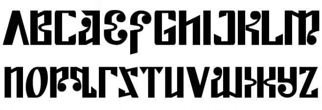
Kremlin Empire LOWERCASE
Kremlin Empire OTHER CHARS
Gallery Examples

-
 Buy font Kremlin Pro Inline Commercial Fonts
 -
 Buy font Kremlin Pro Soft Commercial Fonts
 -
 Buy font Kremlin Pro Regular Commercial Fonts