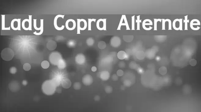
Lady Copra Alternate Font

Lady Copra Alternate Description
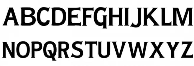
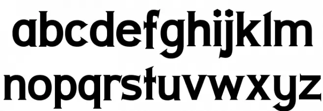
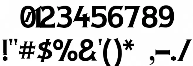
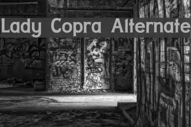
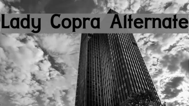
This font features a bold and assertive style with a strong presence. The characters are well-defined with sharp serifs and a slight curvature that adds a touch of elegance. The uppercase letters are tall and commanding, while the lowercase letters maintain a consistent height, offering a harmonious balance. The numerals are clear and distinct, making them easily readable. Special characters are crafted with precision, enhancing the overall aesthetic. This font is suitable for making statements and capturing attention.
A bold serif font with sharp serifs and a strong, elegant presence from Typewriter fonts.
- Downloads: 691
- ( Fonts by Apostrophic Lab FREE )
- LADYCA__.ttf
- Font: Lady Copra Alternate
- Weight: Regular
- Version: Version 1.0
- No. of Characters:: 227
- Proposed Projects: Ideal for headlines, branding, posters, and editorial design where a strong impact is desired.
- Category:
- Bold: Yes
- Italic: No
- Weight: Bold
- Width: Normal
- Character Spacing: Normal
- Contrast: High
- Overall Style: Modern
- Use Case: Headlines, Logos
- Encoding Scheme:
- Is Fixed Pitch: No
Glyphs ! # $ % ( ) * + , - . / 0 1 2 3 4 5 6 7 8 9 : ; = ? @ A B C D E F G H I J K L M N O P Q R S T U V W X Y Z [ ] ^ _ ` a b c d e f g h i j k l m n o p q r s t u v w x y z { | } ~
Lady Copra Alternate UPPERCASE
Lady Copra Alternate LOWERCASE
Lady Copra Alternate OTHER CHARS
Gallery Examples
Download Free Fonts
Commercial Fonts Fonts
-
 Buy font Lady Dodo Commercial Fonts
 -
 Buy font Lady Dodo Patterns Commercial Fonts
 -
 Buy font Lady Fair JF Commercial Fonts