Free Fonts
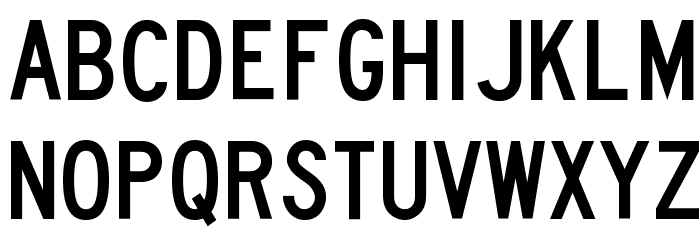
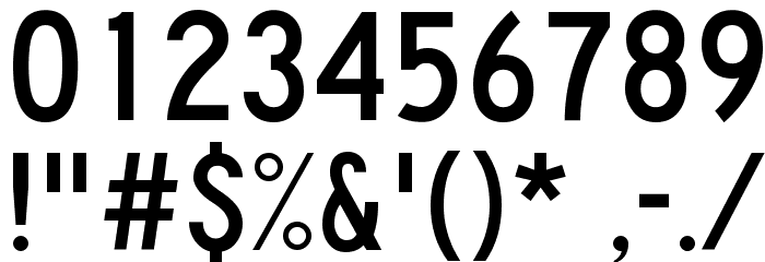
Lane B Font

General information
- Downloads: 2,178
- LANE_B.TTF
- Font: Lane B
by LOMBAXRATCHET - Weight: Regular
- Version: Version 1.
- No. of Characters:: 218
- Encoding Scheme:
- Is Fixed Pitch: No
Glyphs ! # $ % ( ) * + , - . / 0 1 2 3 4 5 6 7 8 9 : ; = ? @ A B C D E F G H I J K L M N O P Q R S T U V W X Y Z [ ] ^ _
UPPERCASE

LOWERCASE
OTHER CHARS
Gallery Examples


Download
2,178 Downloads
Download Free Fonts
-
 Traffic 02 Download Traffic 02
 -
Highway Gothic Narrow Download Highway Gothic Narrow


Commercial Fonts Fonts


Fonts Commercial Fonts
-
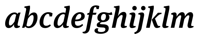
Buy font Yrsa SemiBold Commercial Fonts
-
Buy font Broadsheet Italic Commercial Fonts
-
Buy font Anonymous Pro Regular Commercial Fonts
-
Buy font Broadsheet Regular Commercial Fonts
-
Buy font Anonymous Pro Italic Commercial Fonts
-
Buy font Anonymous Pro Bold Commercial Fonts
-
Buy font Emily Austin Regular Commercial Fonts
-
Buy font Anonymous Pro Bold Italic Commercial Fonts
-
Buy font Nuvo Pro Italic Commercial Fonts
-
Buy font Old Man Eloquent Bold Commercial Fonts
-
Buy font Nuvo Pro Extrabold Italic Commercial Fonts
-
Buy font Nuvo Pro Bold Italic Commercial Fonts
-
Buy font Old Man Eloquent Regular Commercial Fonts
-
Buy font Nuvo Pro Black Commercial Fonts
-
Buy font Nuvo Pro Black Italic Commercial Fonts
-
Buy font American Scribe Regular Commercial Fonts
-
Buy font Meta Serif Pro Medium Italic Commercial Fonts
-
Buy font Attic Antique Italic Commercial Fonts