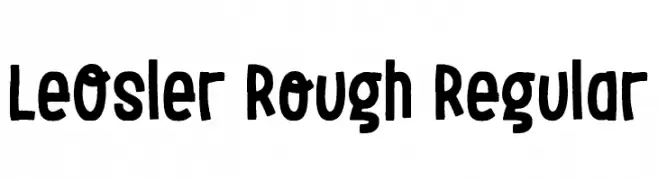
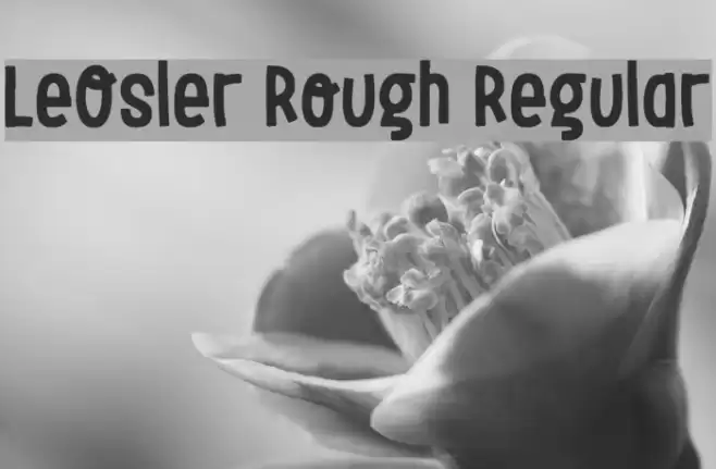
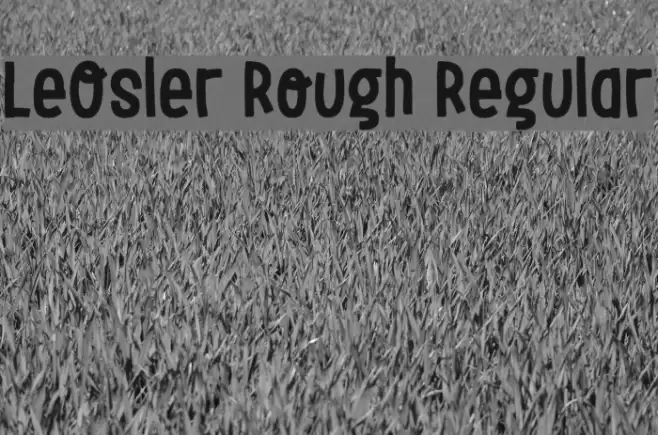
LeOsler Rough Regular Font
LeOsler Rough Regular Description
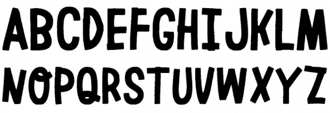
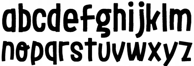
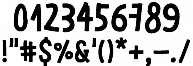
This font exhibits a playful and rough aesthetic, characterized by its hand-drawn appearance. The letters are bold and slightly irregular, giving a casual and artistic feel. The uppercase and lowercase letters maintain a consistent style, with rounded edges and varying stroke widths that contribute to its informal charm. The numerals and special characters follow the same design principles, ensuring a cohesive look across all glyphs. This font is ideal for projects that require a touch of creativity and personality, such as posters, invitations, or branding for artistic ventures.
A playful, hand-drawn font with a bold and rough aesthetic from Uncategorized fonts.
- Downloads: 314
- ( Antipixel - Julia Martínez Diana - www.antipixel.com.ar/ FREE )
- LeOsler_Rough-Regular.ttf
- Font: LeOsler Rough Regular
- Weight: Rough Regular
- Version: Version Version 1.000
- No. of Characters:: 1711
- Proposed Projects: Ideal for posters, invitations, artistic branding, and creative projects.
- Category:
- Bold: Yes
- Italic: No
- Weight: Bold
- Width: Normal
- Character Spacing: Normal
- Contrast: Medium
- Overall Style: Decorative
- Use Case: Headlines, Logos
- Encoding Scheme:
- Is Fixed Pitch: No
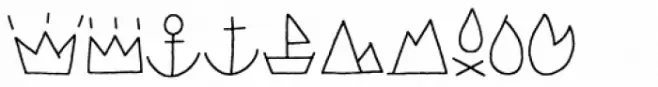
Glyphs ! # $ % ( ) * + , - . / 0 1 2 3 4 5 6 7 8 9 : ; = ? @ A B C D E F G H I J K L M N O P Q R S T U V W X Y Z [ ] ^ _ ` a b c d e f g h i j k l m n o p q r s t u v w x y z { | } ~
LeOsler Rough Regular UPPERCASE
LeOsler Rough Regular LOWERCASE
LeOsler Rough Regular OTHER CHARS
Gallery Examples

-
 Buy font LeOsler Rough Icon Light Commercial Fonts
 -
 Buy font LeOsler Rough Icon Regular Commercial Fonts
 -
 Buy font LeOsler Sharp Regular Commercial Fonts