Fonts
Libre Franklin ExtraBold Italic Font
Description
- LibreFranklin-ExtraBoldItalic.ttf
- Font: Libre Franklin ExtraBold Italic
- Weight: Italic
- Version: Version Version 1.002; ttfautohint [v1.5]
- No. of Characters:: 530
- Encoding Scheme:
- Is Fixed Pitch: 0
Welcome to the Font Trends page — your destination for discovering which fonts are shaping today’s design landscape. Whether you’re working on a brand refresh, social media visuals, or website UI, following current font trends helps your work feel fresh and relevant.
This collection features the most trending fonts of the season, chosen by designers and creators across the world. Expect to see elegant serifs, minimalist sans serifs, expressive display fonts, and handcrafted scripts that define modern aesthetics in 2025.
Combine your favorite trending typefaces with timeless categories like Modern, Serif, or Handwritten for a balanced and eye-catching design.
-
 Download 3062 Downloads@WebFont
 -
( Fonts by Annie de la Vega )
A playful and bold font with a wavy, dynamic style.
![Happy Happy Joy Joy Free Fonts Download]() Download 995 Downloads@WebFont
Download 995 Downloads@WebFont -
![Fast 99 Free Fonts Download]() Download 338 Downloads@WebFont
Download 338 Downloads@WebFont -
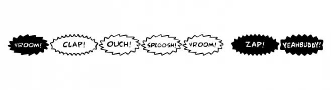
![Comic FX Free Fonts Download]() Download 501 Downloads@WebFont
Download 501 Downloads@WebFont -
( Fonts by Colorful Typhoon - http://orange.s56.xrea.com/blog/ )
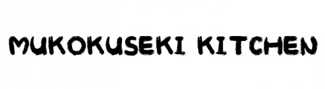
A bold, brushstroke font with a textured, hand-painted look.
![MUKOKUSEKI KITCHEN Free Fonts Download]() Download 428 Downloads@WebFont
Download 428 Downloads@WebFont -
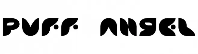
![Puff Angel Free Fonts Download]() Download 269 Downloads
Download 269 Downloads -
![Lethargic BRK Free Fonts Download]() Download 356 Downloads@WebFont
Download 356 Downloads@WebFont -
( Fonts by Graham Meade - GemFonts )
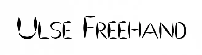
A bold, artistic freehand font with dynamic strokes and a lively appearance.
![Ulse Freehand Free Fonts Download]() Download 400 Downloads@WebFont
Download 400 Downloads@WebFont


FAQ — Font Trends
What are the current font trends?
Simplicity, legibility, and warmth dominate: rounded sans serifs, high-contrast serifs, and tasteful retro revivals are everywhere — clean but human.
Which fonts are trending in design right now?
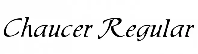
Popular choices include Chaucer Regular, Happy Happy Joy Joy, Fast 99, Comic FX and MUKOKUSEKI KITCHEN — fonts known for their balance between modern and timeless. They look great on web pages, social content, and packaging, bringing a clean yet expressive feel.
How do I use trending fonts in my projects?
Use one standout display font for titles and pair it with a simple sans serif for body text. This creates contrast without losing readability. Always test how your chosen font trend performs across screen sizes and branding materials before finalizing.
💡 Tip: Refresh key assets every few months with a new trending font to keep visuals sharp and discoverable.