Fonts
Linux Libertine Display Capitals Font
Description
- LinLibertine_aDRS.ttf
- Font: Linux Libertine Display Capitals
- Weight: Small Caps
- Version: Version Version 5.0.9
- No. of Characters:: 2247
- Encoding Scheme:
- Is Fixed Pitch: 0
Welcome to the Font Trends page — your destination for discovering which fonts are shaping today’s design landscape. Whether you’re working on a brand refresh, social media visuals, or website UI, following current font trends helps your work feel fresh and relevant.
This collection features the most trending fonts of the season, chosen by designers and creators across the world. Expect to see elegant serifs, minimalist sans serifs, expressive display fonts, and handcrafted scripts that define modern aesthetics in 2025.
Combine your favorite trending typefaces with timeless categories like Modern, Serif, or Handwritten for a balanced and eye-catching design.
-
( Fonts by Daniel Zadorozny - www.iconian.com )
A bold, 3D geometric font with a futuristic and italicized style.
 Download 215 Downloads@WebFont
 -
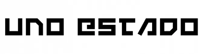
( Fonts by Daniel Zadorozny - www.iconian.com )
A bold, geometric font with a futuristic and angular design.
![Uno Estado Free Fonts Download]() Download 202 Downloads@WebFont
Download 202 Downloads@WebFont -
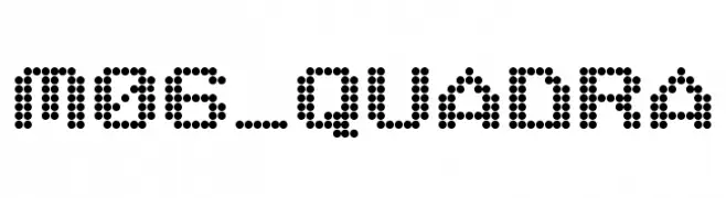
( Fonts by Miffies - mfs.jp.org - Personal-use only. For commercial use please contact owner. )
A dot matrix style font with a futuristic and digital appearance.
![M06_QUADRA Free Fonts Download]() Download 1540 Downloads@WebFont
Download 1540 Downloads@WebFont -
![electron 8f Free Fonts Download]() Download 227 Downloads@WebFont
Download 227 Downloads@WebFont -
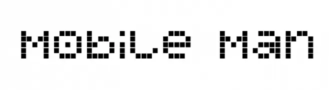
( Fonts by dustBUST - Andreas Nylin )
A pixelated, retro-style font inspired by early digital displays.
![Mobile Man Free Fonts Download]() Download 257 Downloads@WebFont
Download 257 Downloads@WebFont -
![Futurist Fixed-width Free Fonts Download]() Download 22648 Downloads@WebFont
Download 22648 Downloads@WebFont -
![Term-RegGgg Free Fonts Download]() Download 182 Downloads@WebFont
Download 182 Downloads@WebFont -
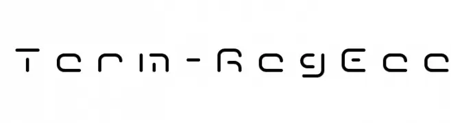
![Term-RegEee Free Fonts Download]() Download 233 Downloads@WebFont
Download 233 Downloads@WebFont


FAQ — Font Trends
What are the current font trends?
Simplicity, legibility, and warmth dominate: rounded sans serifs, high-contrast serifs, and tasteful retro revivals are everywhere — clean but human.
Which fonts are trending in design right now?
Popular choices include Uno Estado 3D Italic, Uno Estado, M06_QUADRA, electron 8f and Mobile Man — fonts known for their balance between modern and timeless. They look great on web pages, social content, and packaging, bringing a clean yet expressive feel.
How do I use trending fonts in my projects?
Use one standout display font for titles and pair it with a simple sans serif for body text. This creates contrast without losing readability. Always test how your chosen font trend performs across screen sizes and branding materials before finalizing.
💡 Tip: Refresh key assets every few months with a new trending font to keep visuals sharp and discoverable.