Fonts
M+ 2c medium Font
Description
- mplus-2c-medium.ttf
- Font: M+ 2c medium
- Weight: Regular
- Version: Version Version 1.036
- No. of Characters:: 5446
- Encoding Scheme:
- Is Fixed Pitch: 0
Welcome to the Font Trends page — your destination for discovering which fonts are shaping today’s design landscape. Whether you’re working on a brand refresh, social media visuals, or website UI, following current font trends helps your work feel fresh and relevant.
This collection features the most trending fonts of the season, chosen by designers and creators across the world. Expect to see elegant serifs, minimalist sans serifs, expressive display fonts, and handcrafted scripts that define modern aesthetics in 2025.
Combine your favorite trending typefaces with timeless categories like Modern, Serif, or Handwritten for a balanced and eye-catching design.
-
 Download 398 Downloads@WebFont
 -
( Fonts by Levi Halmos )
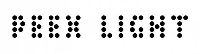
A modern, dotted font with a playful and creative style.
![Peex Light Free Fonts Download]() Download 241 Downloads@WebFont
Download 241 Downloads@WebFont -
![Ravenous Caterpillar BRK Free Fonts Download]() Download 218 Downloads@WebFont
Download 218 Downloads@WebFont -
![Treefrog Free Fonts Download]() Download 6294 Downloads@WebFont
Download 6294 Downloads@WebFont -
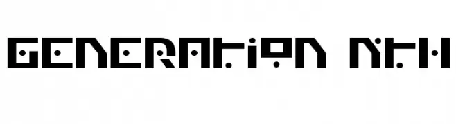
![Generation Nth Free Fonts Download]() Download 357 Downloads
Download 357 Downloads -
( Fonts by Blue Vinyl - Jess Latham - www.bvfonts.com )
A geometric, monospaced font with a digital, tech-inspired aesthetic.
![AIRWAVE 1 Free Fonts Download]() Download 463 Downloads@WebFont
Download 463 Downloads@WebFont -
( Fonts by Jacob Fisher - www.pizzadude.dk )
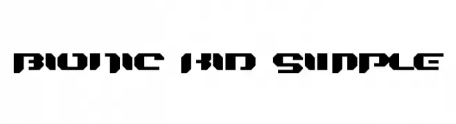
A bold, geometric font with a futuristic, stencil-like design.
![Bionic Kid Simple Free Fonts Download]() Download 323 Downloads@WebFont
Download 323 Downloads@WebFont -
( Fonts by www.stimuleyefonts.com )
A modern, geometric font with consistent stroke width and rounded edges.
![Quares Free Fonts Download]() Download 371 Downloads@WebFont
Download 371 Downloads@WebFont


FAQ — Font Trends
What are the current font trends?
Simplicity, legibility, and warmth dominate: rounded sans serifs, high-contrast serifs, and tasteful retro revivals are everywhere — clean but human.
Which fonts are trending in design right now?
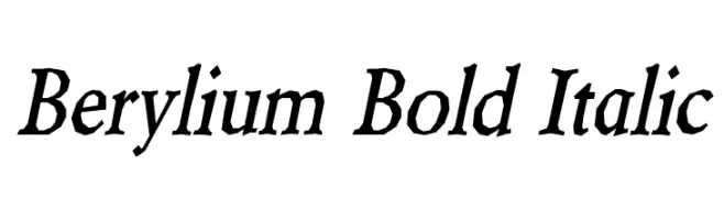
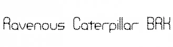
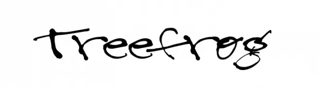
Popular choices include Berylium Bold Italic, Peex Light, Ravenous Caterpillar BRK, Treefrog and Generation Nth — fonts known for their balance between modern and timeless. They look great on web pages, social content, and packaging, bringing a clean yet expressive feel.
How do I use trending fonts in my projects?
Use one standout display font for titles and pair it with a simple sans serif for body text. This creates contrast without losing readability. Always test how your chosen font trend performs across screen sizes and branding materials before finalizing.
💡 Tip: Refresh key assets every few months with a new trending font to keep visuals sharp and discoverable.