Maiers Neue Nr.8 Reduced Bold Slanted Font

Maiers Neue Nr.8 Reduced Bold Slanted Description
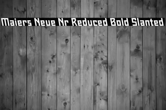
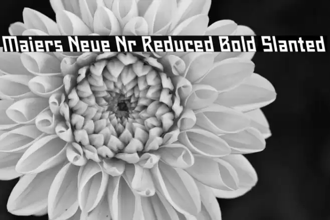
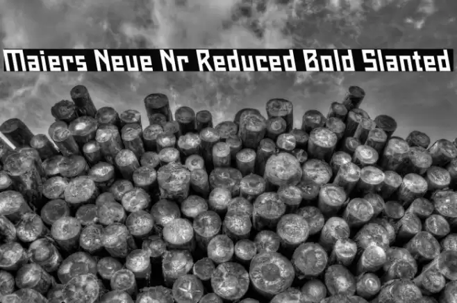
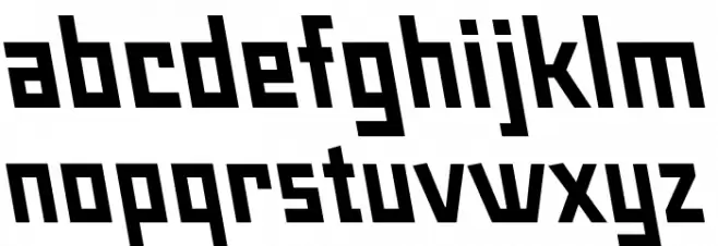
This font features a bold and slanted style with a modern, geometric appearance. The characters are angular with sharp edges, giving it a dynamic and assertive look. The uppercase and lowercase letters maintain a consistent slant, enhancing the font's cohesive design. The bold weight of the font ensures strong visibility, making it suitable for impactful headlines and titles. The character spacing is relatively tight, which contributes to its compact and robust feel. The font's overall style is contemporary and assertive, ideal for projects that require a strong visual presence.
A bold, slanted, and geometric font with a modern and assertive style from Regular fonts.
- Downloads: 69
- ( Fonts by ingoFonts - Ingo Zimmermann - Personal-use only. For commercial use please contact owner. FREE )
- Font: Maiers Neue Nr.8 Reduced Bold Slanted
- Weight: Regular
- Version: Version 1.001
- No. of Characters:: 56
- Proposed Projects: Ideal for branding, posters, headlines, and any design requiring a strong, modern impact.
- Category:
- Bold: Yes
- Italic: Yes
- Weight: Bold
- Width: Normal
- Character Spacing: Tight
- Contrast: Low
- Overall Style: Modern
- Use Case: Headlines, Logos
- Encoding Scheme:
- Is Fixed Pitch: No
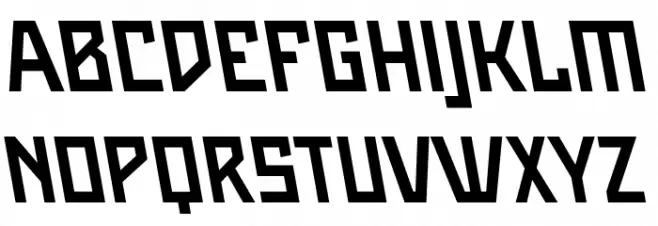
Glyphs A B C D E F G H I J K L M N O P Q R S T U V W X Y Z a b c d e f g h i j k l m n o p q r s t u v w x y z
Maiers Neue Nr.8 Reduced Bold Slanted UPPERCASE
Maiers Neue Nr.8 Reduced Bold Slanted LOWERCASE
Maiers Neue Nr.8 Reduced Bold Slanted OTHER CHARS
Gallery Examples