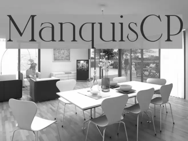
ManquisCP Font

ManquisCP Description
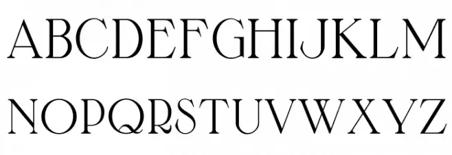
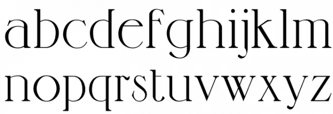
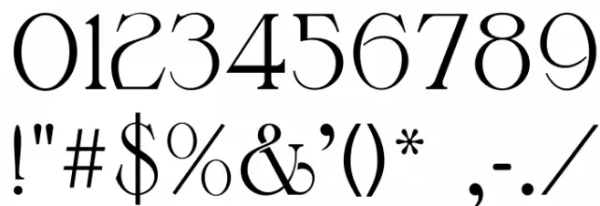
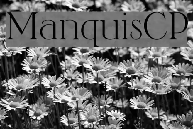
This font features a classic serif style with elegant, thin strokes and high contrast between thick and thin lines. The uppercase letters are tall and stately, with sharp serifs that add a touch of sophistication. Lowercase letters maintain a consistent style, offering a harmonious blend of curves and angles. The numerals are distinctive, with a slight flair that complements the overall design. Special characters are crafted with the same attention to detail, ensuring a cohesive appearance across all glyphs. This font exudes a timeless elegance, making it suitable for a variety of formal and creative applications.
A classic serif font with high contrast and elegant serifs from Uncategorized fonts.
- Downloads: 1,699
- ( Fonts by a Claude Pelletier . Personal-use only. For commercial use please contact owner. FREE )
- ManquisCP.otf
- Font: ManquisCP
- Weight: Regular
- Version: Version 1.0
- No. of Characters:: 182
- Proposed Projects: Ideal for editorial design, book covers, luxury branding, and formal invitations.
- Category:
- Bold: No
- Italic: No
- Weight: Regular
- Width: Normal
- Character Spacing: Normal
- Contrast: High
- Overall Style: Classic
- Use Case: Headlines, Body text, Logos
- Encoding Scheme:
- Is Fixed Pitch: No
Glyphs ! # $ % ( ) * + , - . / 0 1 2 3 4 5 6 7 8 9 : ; = ? @ A B C D E F G H I J K L M N O P Q R S T U V W X Y Z [ ] ^ _ ` a b c d e f g h i j k l m n o p q r s t u v w x y z { | } ˚
ManquisCP UPPERCASE
ManquisCP LOWERCASE
ManquisCP OTHER CHARS
Gallery Examples

Download Free Fonts
Commercial Fonts Fonts
-
 Buy font Adorn Smooth Coronet Commercial Fonts
 -
 Buy font Adorn Smooth Expanded Sans Commercial Fonts
 -
 Buy font Adorn Smooth Roman Commercial Fonts