Misunderstanding Font

Misunderstanding Description
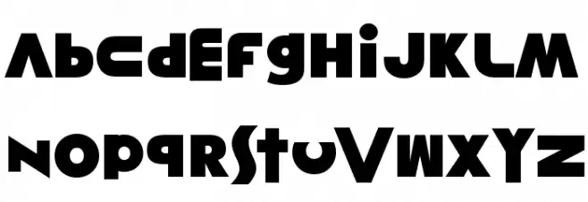
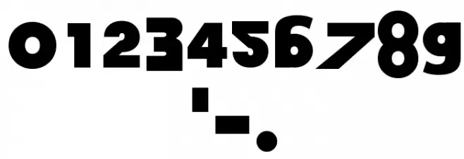
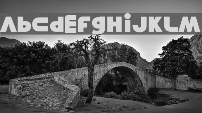
This font features a bold and geometric style with strong, angular lines and a modern aesthetic. The characters are constructed with a unique blend of sharp edges and smooth curves, creating a dynamic and eye-catching appearance. The uppercase and lowercase letters maintain a consistent weight, contributing to a cohesive look. The numerals and special characters are designed with the same boldness, ensuring uniformity across all glyphs. This font's distinct style makes it suitable for projects that require a strong visual impact.
A bold, geometric font with sharp edges and smooth curves from Distorted Eroded fonts.
- Downloads: 142
- ( xerographer.blogspot.com FREE )
- Misunderstanding.ttf
- Font: Misunderstanding
- Weight: Regular
- Version: Version Version 1.00 March 18, 2014, initial release
- No. of Characters:: 43
- Proposed Projects: Ideal for branding, posters, headlines, and any design requiring a modern, impactful look.
- Category:
- Bold: Yes
- Italic: No
- Weight: Bold
- Width: Normal
- Character Spacing: Normal
- Contrast: Low
- Overall Style: Modern
- Use Case: Headlines, Logos
- Encoding Scheme:
- Is Fixed Pitch: No
Glyphs - . 0 1 2 3 4 5 6 7 8 9 A B C D E F G H I J K L M N O P Q R S T U V W X Y Z
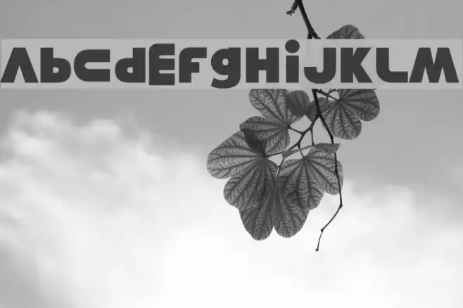
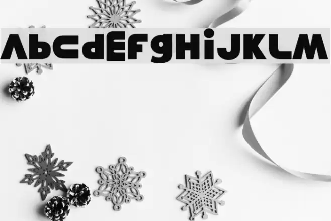
Misunderstanding UPPERCASE

Misunderstanding LOWERCASE
Misunderstanding OTHER CHARS
Gallery Examples
Download Free Fonts
Commercial Fonts Fonts
-
 Buy font PYTears Cinema Commercial Fonts
 -
 Buy font PYRoads Portrait1 Commercial Fonts
 -
 Buy font PYGardens Landscape Commercial Fonts