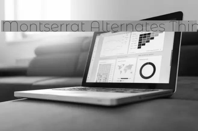
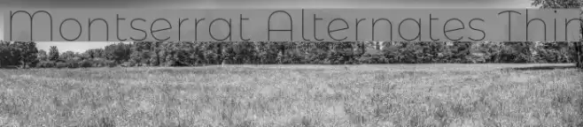
Montserrat Alternates Thin Font

Montserrat Alternates Thin Description
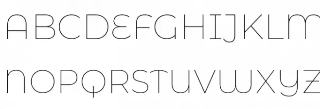
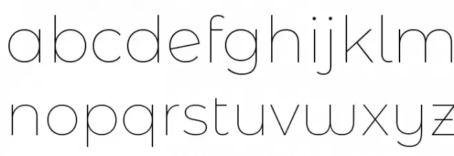
This font features a clean and minimalist design with a geometric structure. The characters are thin and evenly spaced, providing a modern and airy feel. The uppercase letters have a uniform height, while the lowercase letters maintain a consistent baseline. The numerals are sleek and align well with the overall style, making them easily readable. Special characters are designed with the same thin strokes, ensuring a cohesive look across all elements. This font is ideal for projects that require a contemporary and elegant touch.
A thin, geometric font with a modern and minimalist design from Uncategorized fonts.
- Downloads: 1,026
- ( Copyright 2011 The Montserrat Project Authors (https://github.com/JulietaUla/Montserrat) FREE )
- MontserratAlternates-Thin.ttf
- Font: Montserrat Alternates Thin
- Weight: Regular
- Version: Version Version 7.200
- No. of Characters:: 1482
- Proposed Projects: Ideal for branding, editorial design, digital interfaces, and minimalist posters.
- Category:
- Bold: No
- Italic: No
- Weight: Light
- Width: Normal
- Character Spacing: Normal
- Contrast: Low
- Overall Style: Modern
- Use Case: Headlines, Body text, Logos
- Encoding Scheme:
- Is Fixed Pitch: No
Glyphs ! # $ % ( ) * + , - . / 0 1 2 3 4 5 6 7 8 9 : ; = ? @ A B C D E F G H I J K L M N O P Q R S T U V W X Y Z [ ] ^ _ ` a b c d e f g h i j k l m n o p q r s t u v w x y z { | } ~
Montserrat Alternates Thin UPPERCASE
Montserrat Alternates Thin LOWERCASE
Montserrat Alternates Thin OTHER CHARS

Gallery Examples