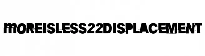
More is less 22 Displacement Font
More is less 22 Displacement Description
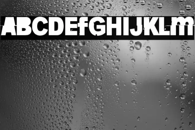
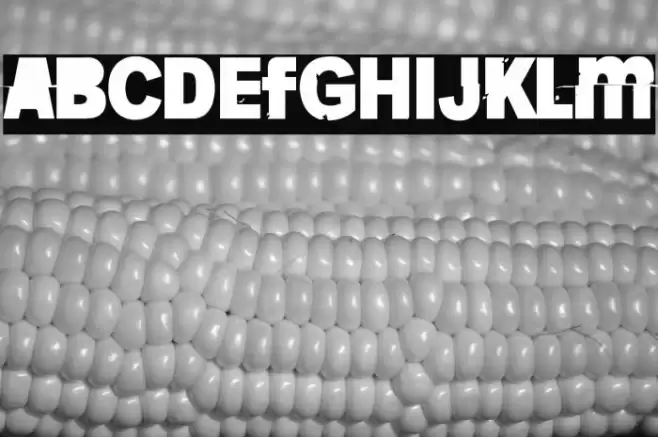
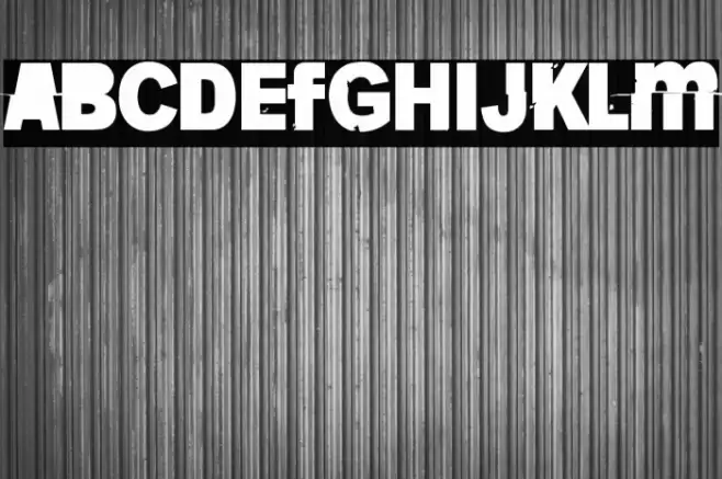
This font features a bold and striking design with a distressed, glitch-like appearance. The characters are heavily stylized, with portions of each letter appearing to be displaced or fragmented, creating a sense of movement and chaos. The uppercase and lowercase letters maintain a consistent height, while the numbers and special characters follow the same disruptive pattern. This font's unique style makes it stand out, offering a modern and edgy aesthetic that is both eye-catching and unconventional.
A bold, distressed font with a glitch-like, fragmented appearance from Uncategorized fonts.
- Downloads: 66
- ( Fonts by junkohanhero - Personal-use only. For commercial use please contact owner. FREE )
- Font: More is less 22 Displacement
- Weight:
- Version:
- No. of Characters:: over 20
- Proposed Projects: Ideal for projects that require a modern, edgy look such as album covers, posters, digital art, and branding for tech or music industries.
- Category:
- Bold: Yes
- Italic: No
- Weight: Bold
- Width: Normal
- Character Spacing: Normal
- Contrast: Low
- Overall Style: Modern
- Use Case: Headlines, Logos, Posters
- Encoding Scheme:
- Is Fixed Pitch: No
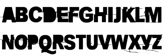
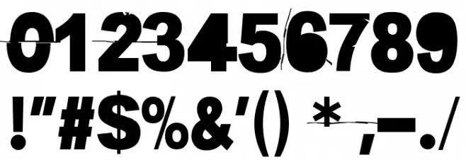
Glyphs
More is less 22 Displacement UPPERCASE
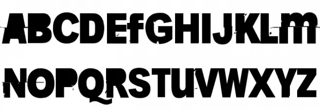
More is less 22 Displacement LOWERCASE
More is less 22 Displacement OTHER CHARS
Gallery Examples
Download
66 Downloads
-
 Buy font Univers Next Pro 220 Condensed Thin Commercial Fonts
 -
 Buy font Univers Next Pro 221 Condensed Thin Italic Commercial Fonts
 -
 Buy font Staccato 222 Commercial Fonts