NASA CONSOLE Font
✎ Military
📄 PostScript
🔢 90 chars
⬇ 944
✅ Free
✅ Web Font

NASA CONSOLE Description
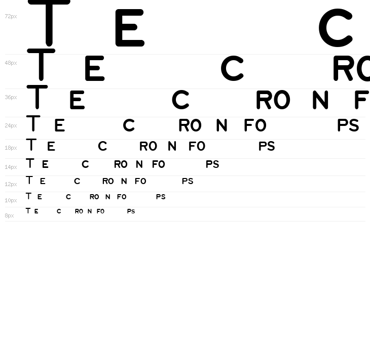
This font features a clean, geometric design with rounded edges, giving it a modern and approachable feel. The characters are evenly spaced, providing excellent readability. The uppercase letters are bold and prominent, while the lowercase letters maintain a consistent style, ensuring uniformity across text. The numerals are clear and distinct, making them ideal for data presentation. Special characters are included, adding versatility for various uses. The overall style is minimalistic yet functional, suitable for both digital and print media.
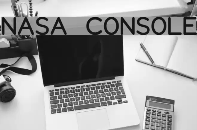
NASA CONSOLE
Font by spideraysfonts. For commercial use please contact the owner.

This font includes 90 characters. Click on any character to see details.
Numbers & Symbols
NASA-CONSOLE UPPERCASE

NASA-CONSOLE LOWERCASE

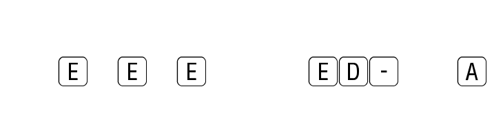
NASA-CONSOLE OTHER CHARS

GALLERY EXAMPLES


Similar Free Fonts

Similar Commercial Fonts


Business Card

Social Header

Logo
Poster

Information
| Name | NASA CONSOLE |
| TTF Name | NASA CONSOLE.ttf |
| Font Family | 1 |
| Style | 1 |
| Format | PostScript (.ttf) |
| File | NASA-CONSOLE.zip |
| Weight | Regular |
| Version | Version Version 1.007 © SpideRaYsfoNtS. All rights |
| No. of Characters: | 90 |
| Downloads | 944 |
| Added | 2018-04-23 |
| Updated | 2024-11-29 |
| Categories | Military |
| Bold | Yes |
| Italic | No |
| Width | Normal |
| Character Spacing | Monospaced |
| Contrast | Low |
| Overall Style | Modern |
| Use Case | Headlines, Body text, Logos |
| Proposed Projects | Ideal for user interfaces, technical documentation, digital displays, and educational materials. |
| Is Fixed Pitch | No |
| Web Font | Available |
| License | Free for personal use |
NASA CONSOLE
Font by spideraysfonts. For commercial use please contact the owner.
Tags
💻 Windows
- Extract ZIP
- Right-click .ttf -> Install
🍎 macOS
- Extract ZIP
- Double-click .ttf -> Install Font
NASA CONSOLE
Free · PostScript
| Name | NASA CONSOLE |
| Type | PostScript |
| Characters | 90 |
| Downloads | 944 |
| Added | 2018-04-23 |
| Web Font | Available |
| Author | NASA CONSOLE Font by spideraysfonts. For commercial use please contact the owner. |
| Categories | Military |