Fonts
NHL Tampa Bay Font
Description
- NHLTB___.TTF
- Font: NHL Tampa Bay
- Weight: Regular
- Version: Version Macromedia Fontographer 4.1 6/28/05
- No. of Characters:: 66
- Encoding Scheme:
- Is Fixed Pitch: 0
Welcome to the Font Trends page — your destination for discovering which fonts are shaping today’s design landscape. Whether you’re working on a brand refresh, social media visuals, or website UI, following current font trends helps your work feel fresh and relevant.
This collection features the most trending fonts of the season, chosen by designers and creators across the world. Expect to see elegant serifs, minimalist sans serifs, expressive display fonts, and handcrafted scripts that define modern aesthetics in 2025.
Combine your favorite trending typefaces with timeless categories like Modern, Serif, or Handwritten for a balanced and eye-catching design.
-
( Fonts by Apostrophic Lab )
A playful, modern font with rounded terminals and consistent stroke width.
 Download 885 Downloads@WebFont
 -
![Nora Free Fonts Download]() Download 3546 Downloads@WebFont
Download 3546 Downloads@WebFont -
( Paul Lloyd Fonts )
A classic yet modern font with elegant, bold uppercase and harmonious lowercase letters.
![Classic Free Fonts Download]() Download 2813 Downloads@WebFont
Download 2813 Downloads@WebFont -
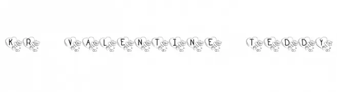
![KR Valentine Teddy Free Fonts Download]() Download 634 Downloads@WebFont
Download 634 Downloads@WebFont -
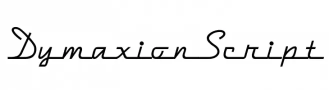
( Fonts by Nick Curtis - www.nicksfonts.com )
A flowing script font with elegant, connected letters and a dynamic slant.
![DymaxionScript Free Fonts Download]() Download 1697 Downloads@WebFont
Download 1697 Downloads@WebFont -
![I Regular Free Fonts Download]() Download 733 Downloads@WebFont
Download 733 Downloads@WebFont -
![Horrendous Free Fonts Download]() Download 653 Downloads@WebFont
Download 653 Downloads@WebFont -
![Funland Park JL Free Fonts Download]() Download 1911 Downloads@WebFont
Download 1911 Downloads@WebFont


FAQ — Font Trends
What are the current font trends?
Simplicity, legibility, and warmth dominate: rounded sans serifs, high-contrast serifs, and tasteful retro revivals are everywhere — clean but human.
Which fonts are trending in design right now?
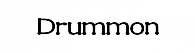
Popular choices include Drummon, Nora, Classic, KR Valentine Teddy and DymaxionScript — fonts known for their balance between modern and timeless. They look great on web pages, social content, and packaging, bringing a clean yet expressive feel.
How do I use trending fonts in my projects?
Use one standout display font for titles and pair it with a simple sans serif for body text. This creates contrast without losing readability. Always test how your chosen font trend performs across screen sizes and branding materials before finalizing.
💡 Tip: Refresh key assets every few months with a new trending font to keep visuals sharp and discoverable.