Neo Metropolis Font
Neo Metropolis Description
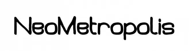
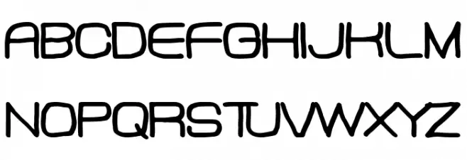
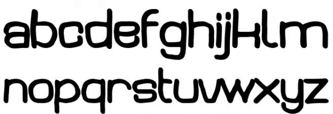
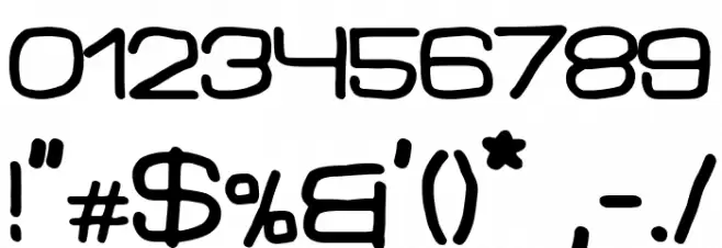
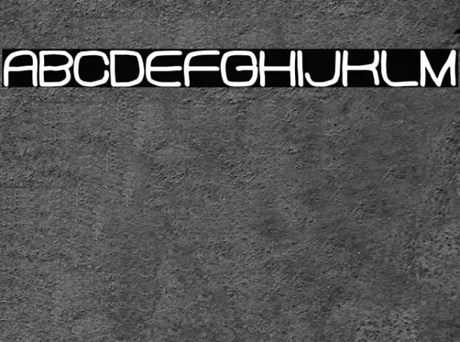
This font features a futuristic and rounded design, characterized by its smooth curves and consistent stroke width. The uppercase letters are bold and slightly elongated, giving a modern and sleek appearance. The lowercase letters maintain a similar style, with a playful yet professional look. Numbers and special characters are designed to match the overall aesthetic, ensuring uniformity across all characters. The font's clean lines and geometric shapes make it suitable for contemporary designs, while its readability ensures versatility in various applications.
A futuristic, rounded font with smooth curves and consistent stroke width from Uncategorized fonts.
- Downloads: 213
- ( Fonts by Woodcutter Manero - http://www.woodcutter.es - Personal-use only. For commercial use please contact owner. FREE )
- Font: Neo Metropolis
- Weight:
- Version:
- No. of Characters:: over 20
- Proposed Projects: Ideal for tech branding, modern advertising, digital interfaces, and futuristic-themed projects.
- Category:
- Bold: Yes
- Italic: No
- Weight: Bold
- Width: Normal
- Character Spacing: Normal
- Contrast: Low
- Overall Style: Modern
- Use Case: Headlines, Logos, Digital Interfaces
- Encoding Scheme:
- Is Fixed Pitch: No
Glyphs
Neo Metropolis UPPERCASE
Neo Metropolis LOWERCASE
Neo Metropolis OTHER CHARS
Gallery Examples
Download
213 Downloads
-
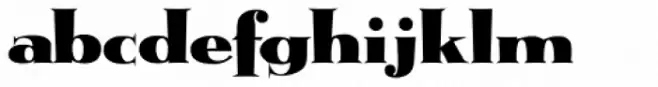 Buy font Metropolis Bold Commercial Fonts
 -
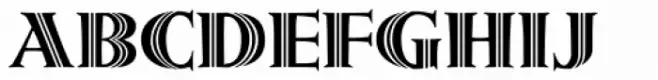 Buy font Metropolis Shaded Commercial Fonts
 -
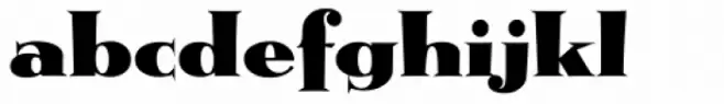 Buy font Metropolis Commercial Fonts