Neuropol Font
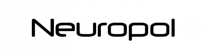
Neuropol Description
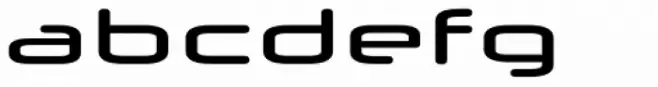
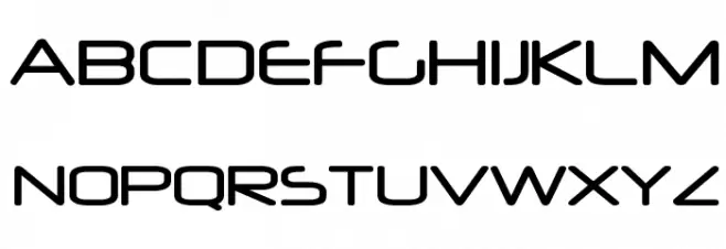
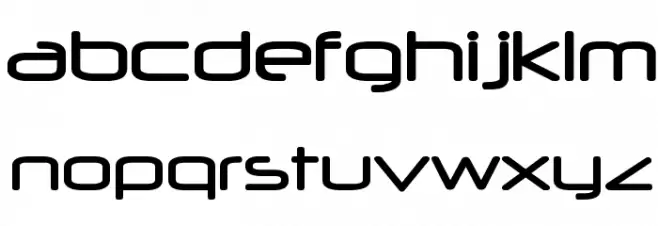
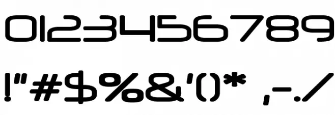
This font features a futuristic and sleek design with rounded edges and a geometric structure. The characters are uniform in height, giving it a modern and cohesive appearance. The uppercase letters are bold and distinct, while the lowercase letters maintain a consistent style with slightly softer curves. Numbers and special characters follow the same design principles, ensuring a harmonious look across all elements. The font's clean lines and minimalistic approach make it suitable for projects that require a contemporary and tech-inspired aesthetic.
A futuristic, geometric font with rounded edges and a sleek design from Decorative fonts.
- Downloads: 14,112
- ( Fonts by www.typodermicfonts.com - Ray Larabie FREE )
- NEUROPOL.ttf
- Font: Neuropol
- Weight: Regular
- Version: Version Version 2.300 2004
- No. of Characters:: 264
- Proposed Projects: Ideal for technology branding, sci-fi movie posters, video game titles, and modern web design.
- Category:
- Bold: No
- Italic: No
- Weight: Regular
- Width: Normal
- Character Spacing: Normal
- Contrast: Low
- Overall Style: Modern
- Use Case: Logos, Headlines, Display
- Encoding Scheme:
- Is Fixed Pitch: No
Glyphs ! # $ % ( ) * + , - . / 0 1 2 3 4 5 6 7 8 9 : ; = ? @ A B C D E F G H I J K L M N O P Q R S T U V W X Y Z [ ] ^ _ ` a b c d e f g h i j k l m n o p q r s t u v w x y z { | } ~
Neuropol UPPERCASE
Neuropol LOWERCASE
Neuropol OTHER CHARS
Gallery Examples