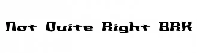
Not Quite Right BRK Font
Not Quite Right BRK Description
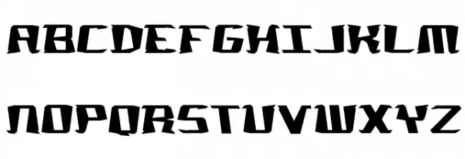
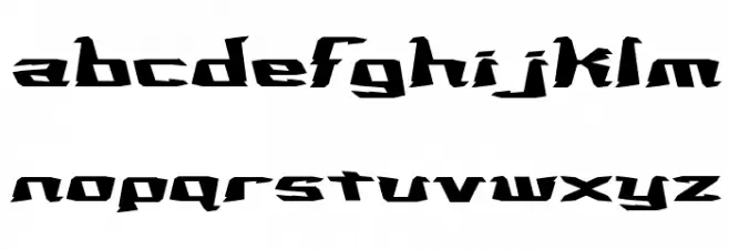
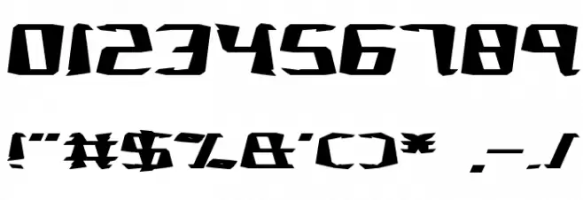
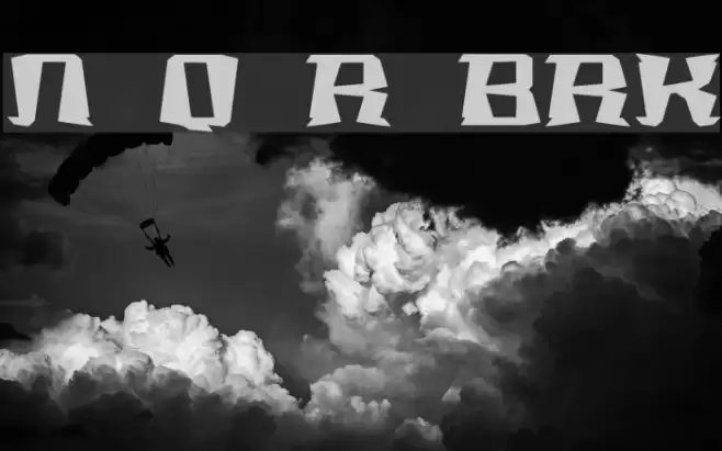
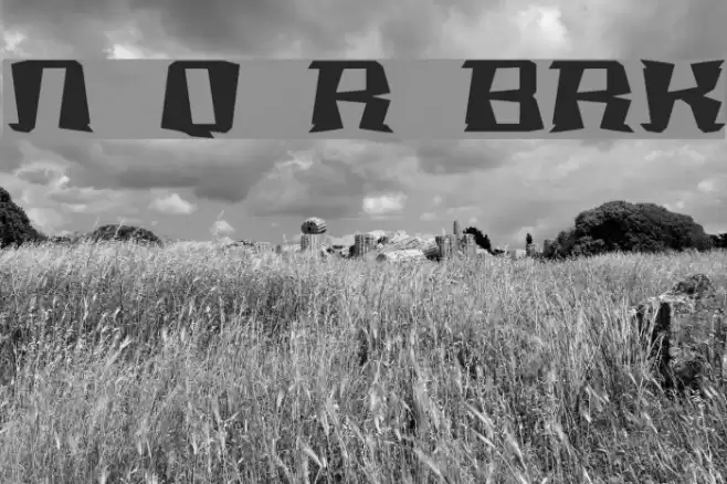
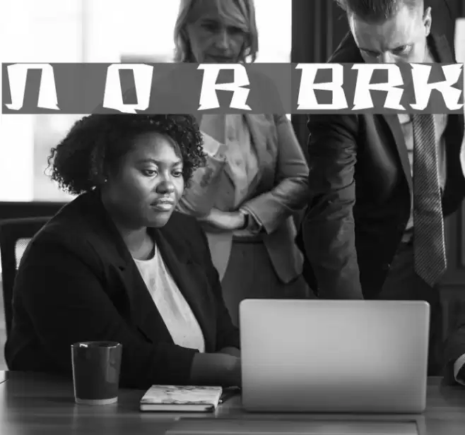
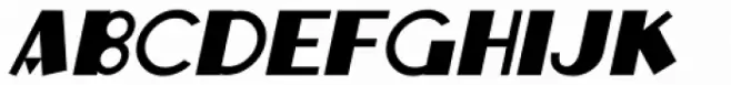
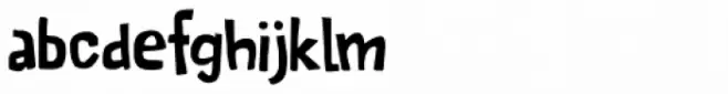
This font features a bold and edgy design with angular, jagged edges that give it a dynamic and rebellious feel. The characters are highly stylized, with sharp cuts and irregular shapes that create a sense of movement and energy. The uppercase and lowercase letters maintain a consistent style, while the numerals and special characters follow the same angular theme. This font is visually striking and commands attention, making it ideal for projects that require a bold statement.
A bold, edgy font with angular, jagged edges and dynamic style from Broken fonts.
- Downloads: 211
- notqr.ttf
- Font: Not Quite Right BRK
- Weight: Regular
- Version: Version Version 2.13
- No. of Characters:: 95
- Proposed Projects: Ideal for music album covers, posters, video game titles, and edgy branding projects.
- Category:
- Bold: Yes
- Italic: No
- Weight: Bold
- Width: Normal
- Character Spacing: Normal
- Contrast: High
- Overall Style: Modern, Edgy
- Use Case: Headlines, Logos, Posters
- Encoding Scheme:
- Is Fixed Pitch: No
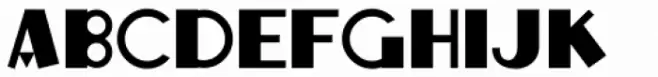
Glyphs ! # $ % ( ) * + , - . / 0 1 2 3 4 5 6 7 8 9 : ; = ? @ A B C D E F G H I J K L M N O P Q R S T U V W X Y Z [ ] _ `
Not Quite Right BRK UPPERCASE
Not Quite Right BRK LOWERCASE
Not Quite Right BRK OTHER CHARS
Gallery Examples
Download Free Fonts
Commercial Fonts Fonts
-
 Buy font Quite Animated JNL Commercial Fonts
 -
 Buy font Quite Animated Oblique JNL Commercial Fonts
 -
 Buy font Quite Something Regular Commercial Fonts