Not So Slim Jim Font

Not So Slim Jim Description
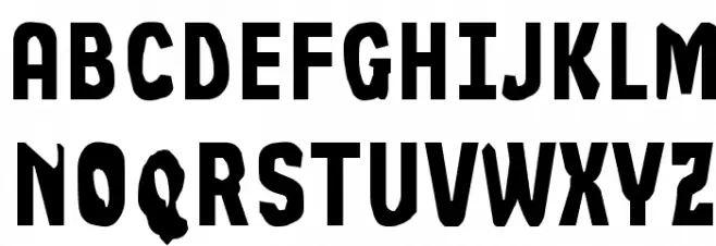
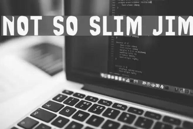
This font features a bold and robust design with a strong presence. The characters are thick and slightly condensed, giving a powerful and impactful look. The strokes are consistent in width, providing a uniform appearance across all characters. The style is reminiscent of industrial or retro themes, making it suitable for projects that require a strong visual statement. The uppercase and lowercase letters maintain a cohesive design, while the numerals and special characters complement the overall aesthetic. This font is ideal for creating eye-catching headlines, posters, and branding materials that demand attention.
A bold, condensed font with an industrial and retro feel from Uncategorized fonts.
- Downloads: 108
- ( Font Emporium - web.archive.org/web/20020126112915/www.fontemporium.com/ FREE )
- NOTSSJ__.TTF
- Font: Not So Slim Jim
- Weight: Regular
- Version: Version obese
- No. of Characters:: 214
- Proposed Projects: Ideal for posters, branding, headlines, and any design requiring a strong visual impact.
- Category:
- Bold: Yes
- Italic: No
- Weight: Bold
- Width: Condensed
- Character Spacing: Normal
- Contrast: Low
- Overall Style: Retro, Industrial
- Use Case: Headlines, Posters, Branding
- Encoding Scheme:
- Is Fixed Pitch: No
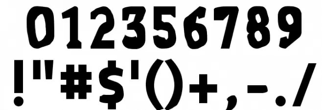
Glyphs ! # $ ( ) + , - . / 0 1 2 3 5 6 7 8 9 : ; = ? A B C D E F G H I J K L M N O Q R S T U V W X Y Z [ ] ^ _ ` a b c d e f g h i j k l m n o q r s t u v w x y z { | } ~
Not So Slim Jim UPPERCASE

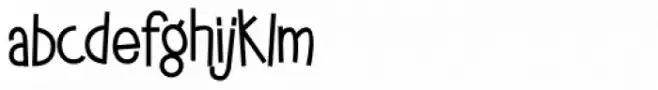
Not So Slim Jim LOWERCASE
Not So Slim Jim OTHER CHARS
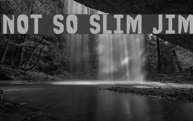
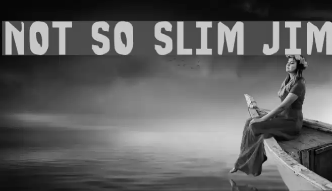
Gallery Examples
Download Free Fonts
-
 Buy font Jiminy Commercial Fonts
 -
 Buy font Jiminy Bolder Commercial Fonts
 -
 Buy font Big Jim Roberts SRF Commercial Fonts