Noto Sans ExtraLight Font

Noto Sans ExtraLight Description
This font features a clean and minimalist design with a focus on readability and simplicity. The characters are evenly spaced and have a uniform stroke width, contributing to a modern and sleek appearance. The uppercase letters are tall and slightly narrow, while the lowercase letters maintain a consistent height, enhancing legibility. The numerals are clear and distinct, making them easily distinguishable. The special characters are well-integrated, maintaining the overall aesthetic of the font. This style is versatile and suitable for a wide range of applications, from digital interfaces to print media.
A clean, minimalist sans-serif font with uniform stroke width and excellent readability from Sans Serif fonts.
- Downloads: 184
- ( Fonts by Google FREE )
- Font: Noto Sans ExtraLight
- Weight:
- Version:
- No. of Characters:: over 20
- Proposed Projects: Ideal for digital interfaces, corporate branding, print media, and user-friendly web design.
- Category:
- Bold: No
- Italic: No
- Weight: Light
- Width: Normal
- Character Spacing: Normal
- Contrast: Low
- Overall Style: Modern
- Use Case: Body text, User interfaces, Branding
- Encoding Scheme:
- Is Fixed Pitch: No
Glyphs
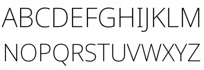
Noto Sans ExtraLight UPPERCASE
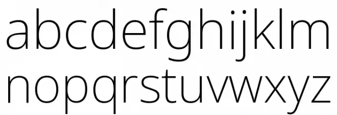
Noto Sans ExtraLight LOWERCASE
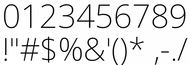
Noto Sans ExtraLight OTHER CHARS
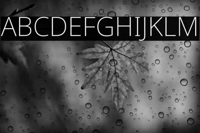
Gallery Examples


-
 Buy font LeBrush ExtraLight Commercial Fonts
 -
 Buy font FF DIN Arabic ExtraLight Commercial Fonts
 -
 Buy font Befter Sans ExtraLight Italic Commercial Fonts