Onderneming Regular Font
Onderneming Regular Description
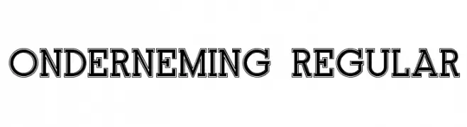
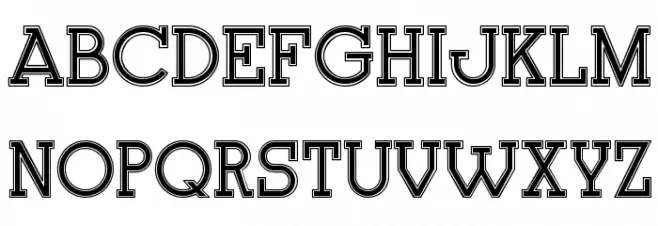
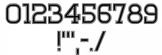
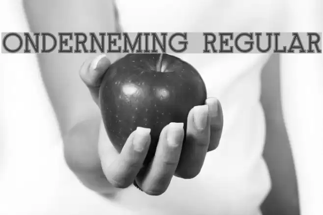
This font features a bold, structured design with a double-line outline that gives it a distinctive, eye-catching appearance. The uppercase letters are uniform in height and width, creating a sense of balance and symmetry. The numerals are equally bold and follow the same double-line style, ensuring consistency across all characters. The special characters, including punctuation marks, are designed to match the overall aesthetic, making this font suitable for a variety of applications where a strong visual impact is desired.
A bold, double-line outlined font with a structured and symmetrical design from Uncategorized fonts.
- Downloads: 160
- ( Vladimir Nikolic - www.coroflot.com/vladimirnikolic FREE )
- Onderneming.ttf
- Font: Onderneming Regular
- Weight: Regular
- Version: Version Version 1.000
- No. of Characters:: 77
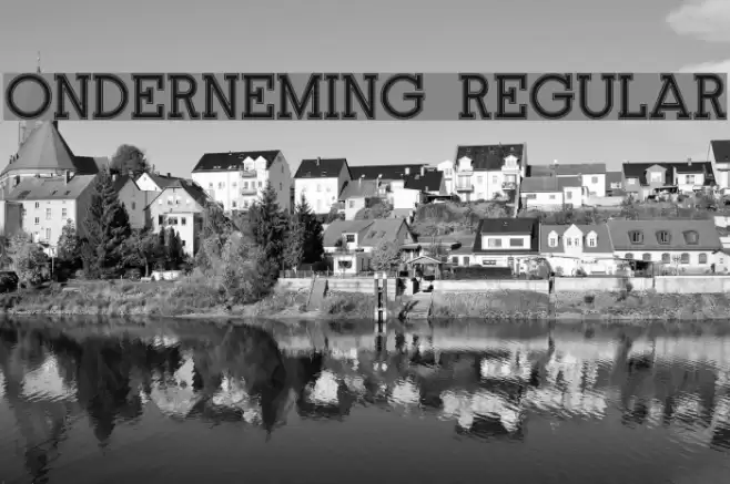
- Proposed Projects: Ideal for headlines, posters, branding, and any project requiring a strong, impactful typeface.
- Category:
- Bold: Yes
- Italic: No
- Weight: Bold
- Width: Normal
- Character Spacing: Normal
- Contrast: Medium
- Overall Style: Modern
- Use Case: Headlines, Logos, Posters
- Encoding Scheme:
- Is Fixed Pitch: No
Glyphs ! , - . / 0 1 2 3 4 5 6 7 8 9 : ; = ? A B C D E F G H I J K L M N O P Q R S T U V W X Y Z a b c d e f g h i j k l m n o p q r s t u v w x y z
Onderneming Regular UPPERCASE

Onderneming Regular LOWERCASE
Onderneming Regular OTHER CHARS
Gallery Examples

Download Free Fonts
-
 Buy font Apollonius Regular Commercial Fonts
 -
 Buy font Dinghybats Regular Commercial Fonts
 -
 Buy font Dinghy Regular Commercial Fonts