Free Fonts Sans-Serif
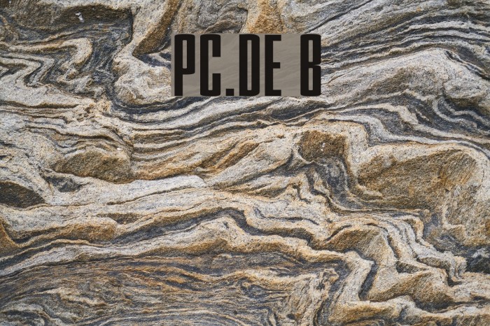
PC.DE Bold Font

Do you have the right license?
Having the right license means that you protect yourself from negative legal consequences of not getting proper permissions. Make sure you have the right license by purchasing the individual font or to use a tool like Envato where all fonts are commercially licensed automatically.
General information
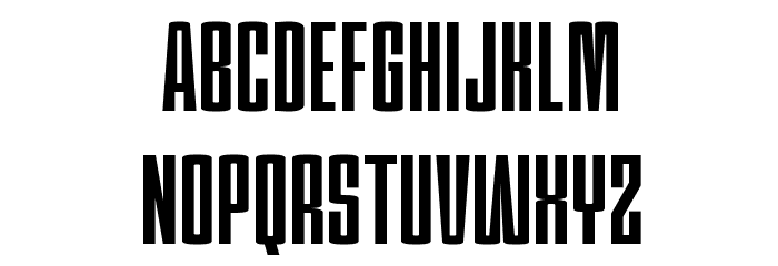
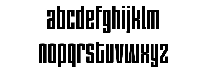
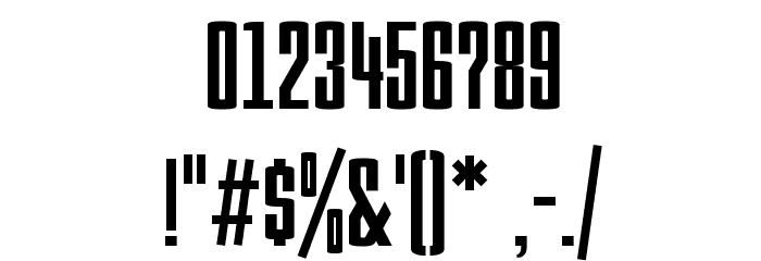
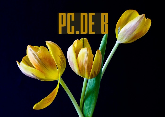
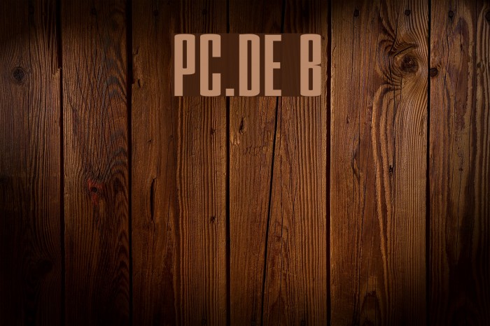
This font features a bold and impactful design, characterized by its tall, narrow letterforms and strong vertical emphasis. The uppercase and lowercase letters maintain a consistent width, creating a uniform appearance. The numerals are similarly designed, ensuring readability and cohesion across different types of content. Special characters are included, maintaining the bold style, making it suitable for a variety of uses. The font's geometric structure and clean lines give it a modern and assertive look, ideal for making a statement.
A bold, narrow font with strong vertical emphasis and modern appeal.
- Downloads: 11,357
- PC DE-Bold.ttf
- Font: PC.DE Bold
- Weight: Bold
- Version: Version 1.0 PC.de Edition
- No. of Characters:: 601
- Proposed Projects: Ideal for headlines, posters, branding, and any project requiring a strong visual impact.
- Category: Sans-Serif
- Bold: Yes
- Italic: No
- Weight: Bold
- Width: Condensed
- Character Spacing: Normal
- Contrast: Low
- Overall Style: Modern
- Use Case: Headlines, Logos, Posters
- Encoding Scheme:
- Is Fixed Pitch: No
Glyphs ! # $ % ( ) * + , - . / 0 1 2 3 4 5 6 7 8 9 : ; = ? @ A B C D E F G H I J K L M N O P Q R S T U V W X Y Z [ ] ^ _
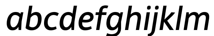
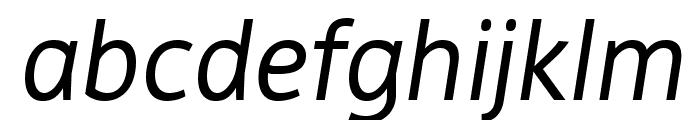
UPPERCASE
LOWERCASE
OTHER CHARS
Gallery Examples
Download Free Fonts
-
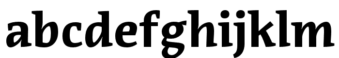
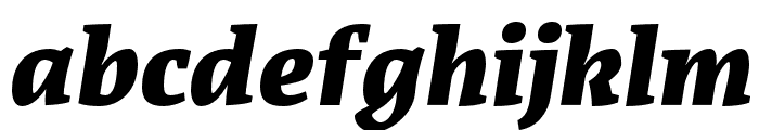
 Executive Download Executive
 -
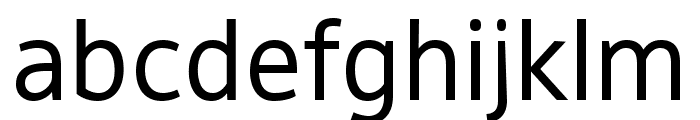
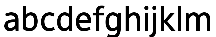
OPTIGamma Download OPTIGamma


Commercial Fonts Fonts
-
Pressio No. 24 Bold X-Compressed Download Pressio No. 24 Bold X-Compressed
Similar free fonts for Pressio No. 24 Bold X-Compressed font -
Baucher Gothic URW Bold Download Baucher Gothic URW Bold
Similar free fonts for Baucher Gothic URW Bold font


Fonts Commercial Fonts
-
Buy font Acuta Medium Commercial Fonts
-
Buy font Acuta Medium Italic Commercial Fonts
-
Buy font Acuta Light Commercial Fonts
-
Buy font Acuta Fat Commercial Fonts
-
Buy font Acuta Fat Italic Commercial Fonts
-
Buy font Acuta Book Commercial Fonts
-
Buy font Acuta Book Italic Commercial Fonts
-
Buy font Acuta Bold Commercial Fonts
-
Buy font Acuta Black Commercial Fonts
-
Buy font Acuta Black Italic Commercial Fonts
-
Buy font DejaRip Regular Commercial Fonts
-
Buy font DejaRip Medium Commercial Fonts
-
Buy font DejaRip Medium Italic Commercial Fonts
-
Buy font DejaRip Italic Commercial Fonts
-
Buy font DejaRip Bold Commercial Fonts
-
Buy font Adobe Caslon Pro Semibold Commercial Fonts
-
Buy font Adobe Caslon Pro Semibold Italic Commercial Fonts
-
Buy font Adobe Caslon Pro Italic Commercial Fonts