Paneuropa Wrong Way Font

Paneuropa Wrong Way Description
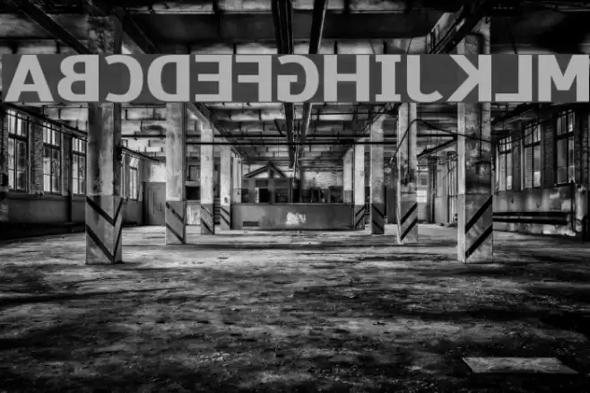
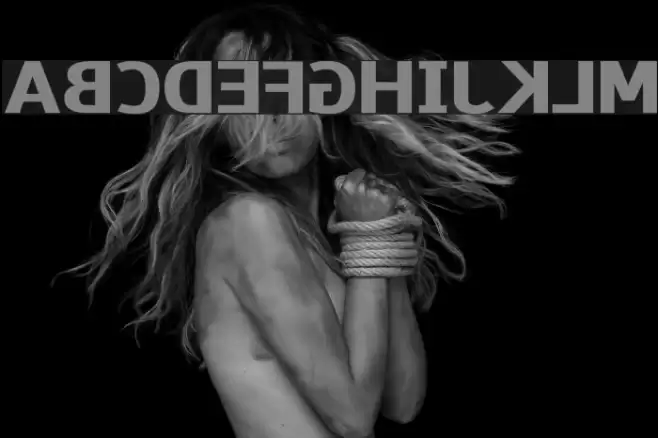
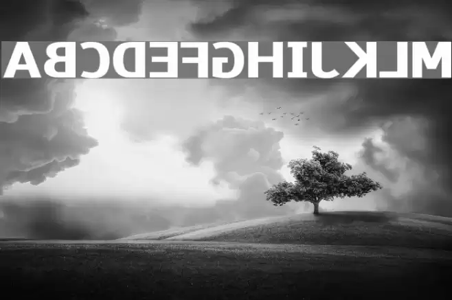
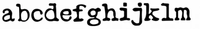
This font features a bold and robust design with strong geometric shapes and a modern aesthetic. The characters are uniformly thick, providing a consistent and powerful visual impact. The uppercase and lowercase letters maintain a cohesive style, with clean lines and sharp angles that enhance readability. The numerals are equally bold, ensuring they stand out in any context. Special characters are designed with the same attention to detail, making them suitable for various applications. The overall impression is one of strength and clarity, making it ideal for impactful headlines and branding.
A bold, geometric font with strong lines and modern appeal from Sans Serif fonts.
- Downloads: 340
- Paneuropa-Wrong-Way.ttf
- Font: Paneuropa Wrong Way
- Weight: Regular
- Version: Version Version 000.001
- No. of Characters:: 740
- Proposed Projects: Ideal for branding, headlines, posters, and any project requiring a strong visual impact.
- Category:
- Bold: Yes
- Italic: No
- Weight: Bold
- Width: Normal
- Character Spacing: Normal
- Contrast: Low
- Overall Style: Modern
- Use Case: Headlines, Logos
- Encoding Scheme:
- Is Fixed Pitch: No
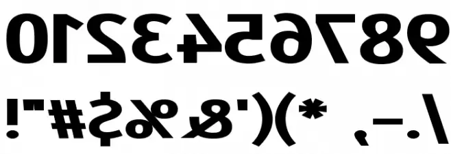
Glyphs ! # $ % ( ) * + , - . / 0 1 2 3 4 5 6 7 8 9 : ; = ? @ A B C D E F G H I J K L M N O P Q R S T U V W X Y Z [ ] ^ _
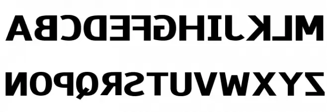
Paneuropa Wrong Way UPPERCASE
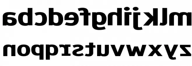
Paneuropa Wrong Way LOWERCASE
Paneuropa Wrong Way OTHER CHARS
Gallery Examples
Download Free Fonts
Commercial Fonts Fonts
-
 Buy font Type Wronger JNL Commercial Fonts
 -
 Buy font Wrongway Bold Commercial Fonts
 -
 Buy font Wrongway Bold Oblique Commercial Fonts