Parallel Night Font
Parallel Night Description
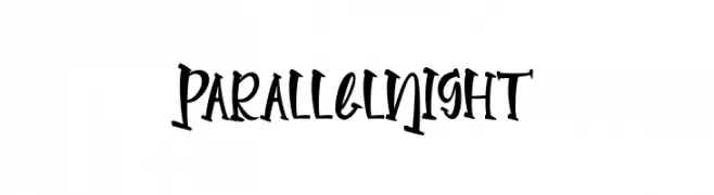
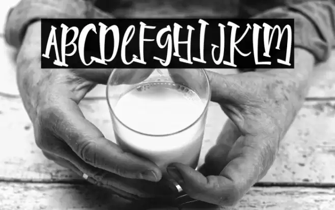
This font features a playful and dynamic style with a handwritten appearance. The letters are slightly slanted, giving a sense of movement and energy. The strokes are bold and have a consistent thickness, which adds to the font's legibility. The characters are uniquely crafted with a whimsical touch, making them stand out. The uppercase and lowercase letters maintain a cohesive design, while the numerals and special characters complement the overall aesthetic. This font is ideal for projects that require a fun and engaging look.
A playful, handwritten-style font with bold, consistent strokes from Uncategorized fonts.
- Downloads: 40
- ( Fonts by Rvandtype - Randi Irvan - Personal-use only. For commercial use please contact owner. FREE )
- Font: Parallel Night
- Weight:
- Version:
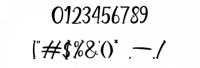
- No. of Characters:: over 20
- Proposed Projects: Ideal for children's books, playful branding, greeting cards, and creative posters.
- Category:
- Bold: Yes
- Italic: No
- Weight: Bold
- Width: Normal
- Character Spacing: Normal
- Contrast: Low
- Overall Style: Decorative
- Use Case: Logos, Headlines, Posters
- Encoding Scheme:
- Is Fixed Pitch: No
Glyphs
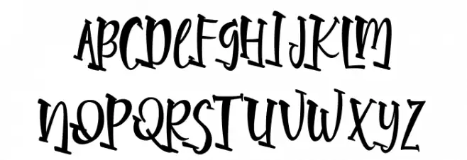
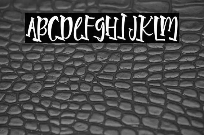
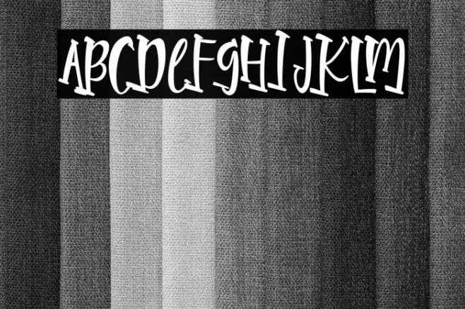
Parallel Night UPPERCASE
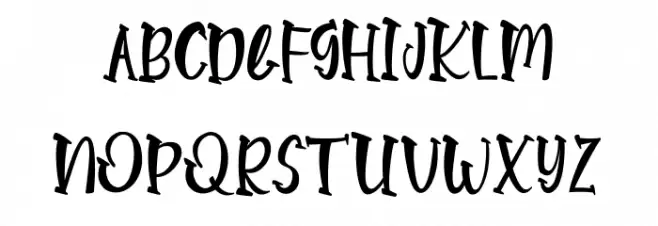
Parallel Night LOWERCASE
Parallel Night OTHER CHARS
Gallery Examples
Download
40 Downloads
-
 Buy font Parallel Thin Commercial Fonts
 -
 Buy font Nightype Nightype Commercial Fonts
 -
 Buy font Date Night JNL Commercial Fonts