Free Fonts Sans-Serif
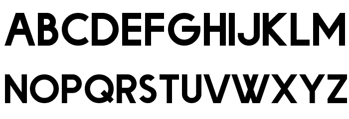
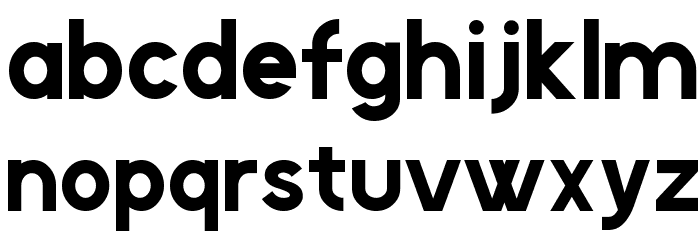
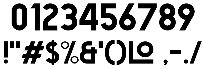
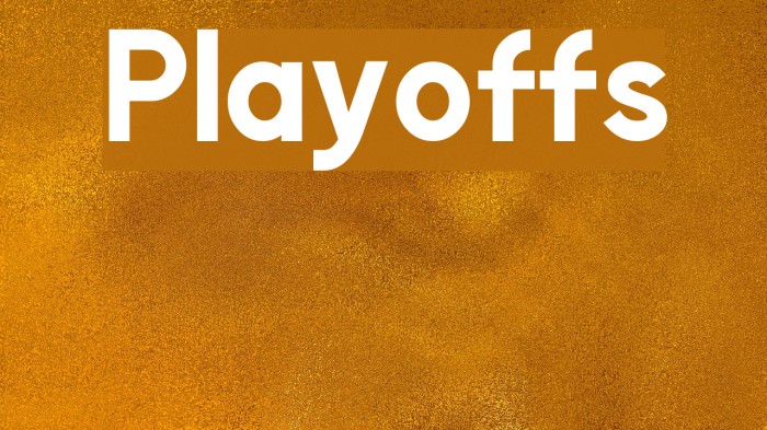
Playoffs Font

Do you have the right license?
Having the right license means that you protect yourself from negative legal consequences of not getting proper permissions. Make sure you have the right license by purchasing the individual font or to use a tool like Envato where all fonts are commercially licensed automatically.
General information
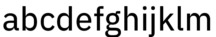
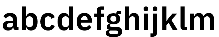
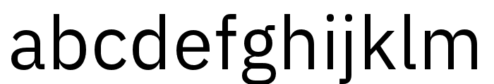
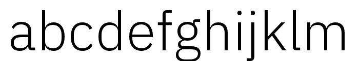
This font features a bold, geometric sans-serif style with clean, modern lines and a strong presence. The characters are uniformly weighted, providing a balanced and harmonious look. The uppercase letters are slightly taller than the lowercase, creating a distinct hierarchy. The numerals are clear and legible, matching the overall aesthetic of the alphabet. Special characters are included, maintaining the same bold and geometric design. This font is versatile, suitable for a variety of design projects that require a contemporary and impactful appearance.
A bold, geometric sans-serif font with a modern and clean aesthetic.
- Downloads: 1,642
- playoffs.ttf
- Font: Playoffs
- Weight: Regular
- Version: Version Version 1.00 October 12, 2015, initial release
- No. of Characters:: 237
- Proposed Projects: Ideal for branding, advertising, headlines, posters, and digital media where a strong visual impact is needed.
- Category: Sans-Serif
- Bold: Yes
- Italic: No
- Weight: Bold
- Width: Normal
- Character Spacing: Normal
- Contrast: Low
- Overall Style: Modern
- Use Case: Headlines, Logos, Posters
- Encoding Scheme:
- Is Fixed Pitch: No
Glyphs ! # $ % ( ) * + , - . / 0 1 2 3 4 5 6 7 8 9 : ; = ? @ A B C D E F G H I J K L M N O P Q R S T U V W X Y Z [ ] ^ _ ` a b c d e f g h i j k l m n o p q r s t u v w x y z { | } ~
UPPERCASE
LOWERCASE
OTHER CHARS
Gallery Examples


Download Free Fonts
-
 Big Orange Cyrillic Download Big Orange Cyrillic
 -
FacileSans Download FacileSans

Commercial Fonts Fonts


Fonts Commercial Fonts
-
Buy font IBM Plex Thai Bold Commercial Fonts
-
Buy font IBM Plex Arabic Thin Commercial Fonts
-
Buy font IBM Plex Arabic Text Commercial Fonts
-
Buy font IBM Plex Arabic SemiBold Commercial Fonts
-
Buy font IBM Plex Arabic Regular Commercial Fonts
-
Buy font IBM Plex Arabic Medium Commercial Fonts
-
Buy font IBM Plex Arabic Light Commercial Fonts
-
Buy font IBM Plex Arabic ExtraLight Commercial Fonts
-
Buy font IBM Plex Arabic Bold Commercial Fonts
-
Buy font Adobe Handwriting Tiffany Commercial Fonts
-
Buy font Adobe Handwriting Frank Commercial Fonts
-
Buy font Adobe Handwriting Ernie Commercial Fonts
-
Buy font Pulpo Bold Italic Commercial Fonts
-
Buy font Pulpo Rust 75 Commercial Fonts
-
Buy font Pulpo Rust 50 Commercial Fonts
-
Buy font Pulpo Rust 25 Commercial Fonts
-
Buy font Pulpo Rust 100 Commercial Fonts
-
Buy font Menco Thin Commercial Fonts