Pretender-Regular Font
Pretender-Regular Description
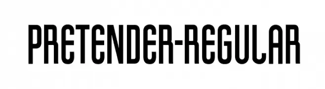
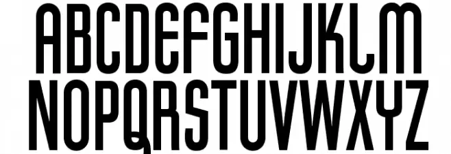
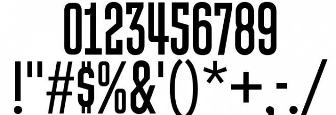
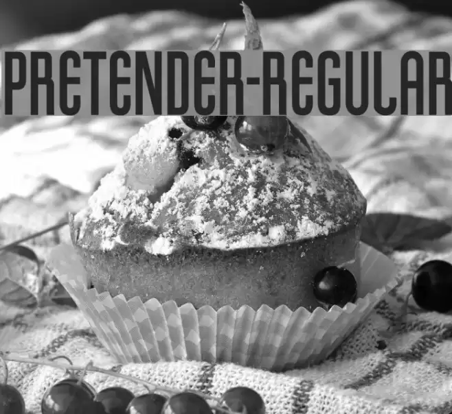
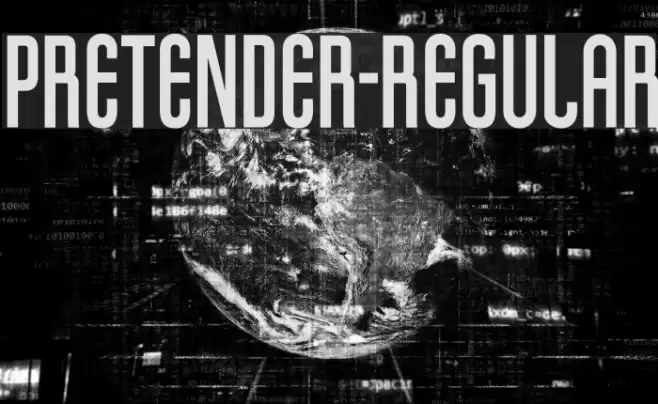
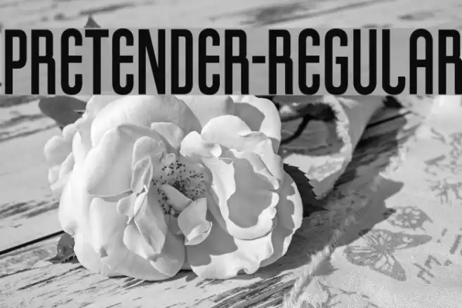
This font exhibits a bold and condensed style with tall, narrow characters that create a striking visual impact. The uppercase letters are uniform in height, while the lowercase letters maintain a consistent alignment, enhancing readability. The numerals are similarly styled, ensuring a cohesive look across all characters. The font's design is modern and geometric, with clean lines and minimal contrast in stroke thickness. Special characters are well-integrated, maintaining the overall aesthetic. This font is ideal for making a bold statement in any design project.
A bold, condensed font with a modern, geometric style from Uncategorized fonts.
- Downloads: 108
- ( Typodermic Fonts - Ray Larabie - www.typodermicfonts.com/ FREE )
- pretender.ttf
- Font: Pretender-Regular
- Weight: Regular
- Version: Version Version 1.000
- No. of Characters:: 395
- Proposed Projects: Ideal for posters, headlines, branding, and advertising materials where a strong visual impact is desired.
- Category:
- Bold: Yes
- Italic: No
- Weight: Bold
- Width: Condensed
- Character Spacing: Tight
- Contrast: Low
- Overall Style: Modern
- Use Case: Headlines, Logos
- Encoding Scheme:
- Is Fixed Pitch: No
Glyphs ! # $ % ( ) * + , - . / 0 1 2 3 4 5 6 7 8 9 : ; = ? @ A B C D E F G H I J K L M N O P Q R S T U V W X Y Z [ ] ^ _ ` a b c d e f g h i j k l m n o p q r s t u v w x y z { | } ~
Pretender-Regular UPPERCASE

Pretender-Regular LOWERCASE
Pretender-Regular OTHER CHARS
Gallery Examples
-
 Buy font Apollonius Regular Commercial Fonts
 -
 Buy font Dinghybats Regular Commercial Fonts
 -
 Buy font Dinghy Regular Commercial Fonts