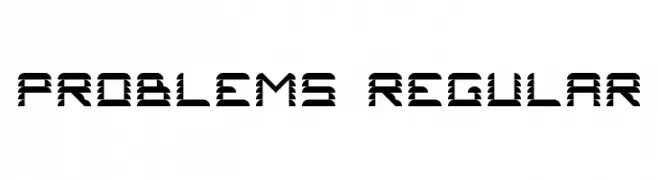
Problems 2 Regular Font
Problems 2 Regular Description
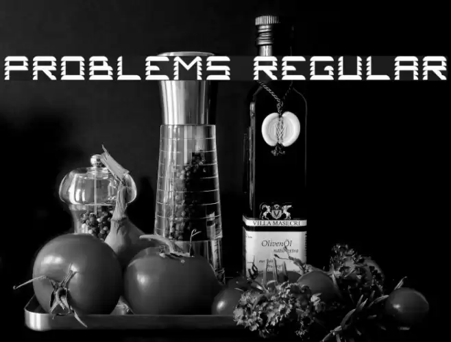
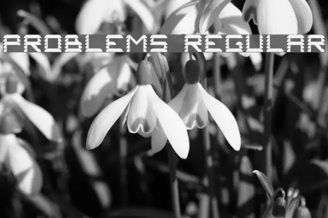
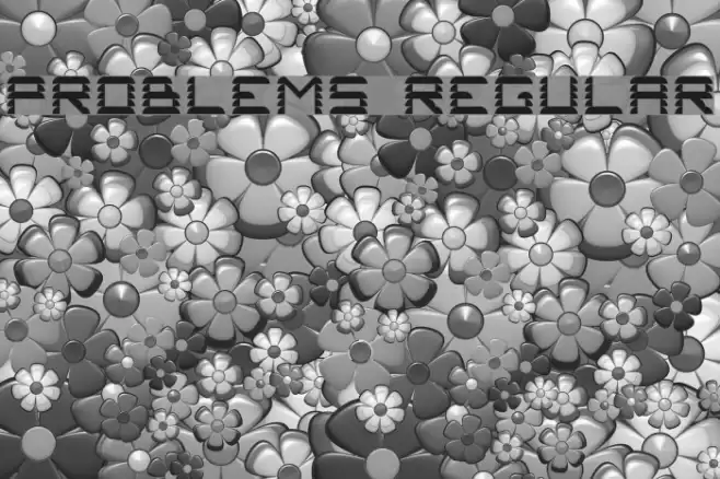
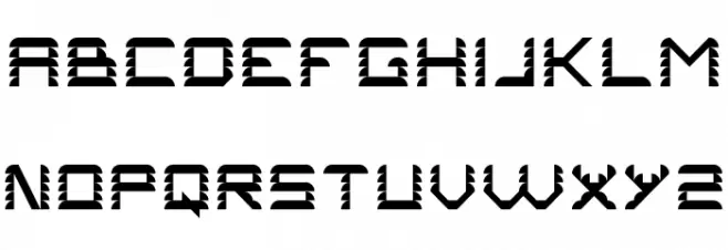
This font features a bold and striking design with a unique pattern of diagonal lines cutting through each character, creating a dynamic and edgy appearance. The uppercase letters are uniform in height, with sharp angles and a futuristic aesthetic. The characters are evenly spaced, maintaining a consistent and balanced look across the board. The font's geometric structure and high contrast between the thick and thin strokes make it stand out, ideal for attention-grabbing designs. Its modern and innovative style is perfect for projects that require a bold statement.
A bold, futuristic font with diagonal line patterns and high contrast from Uncategorized fonts.
- Downloads: 54
- ( Jeronimo - Jeroen Kant FREE )
- Problems #1.ttf
- Font: Problems 2 Regular
- Weight: Regular
- Version: Version Version 1.0
- No. of Characters:: 56
- Proposed Projects: Ideal for branding, posters, album covers, and any project needing a modern, edgy look.
- Category:
- Bold: Yes
- Italic: No
- Weight: Bold
- Width: Normal
- Character Spacing: Normal
- Contrast: High
- Overall Style: Modern
- Use Case: Headlines, Logos
- Encoding Scheme:
- Is Fixed Pitch: No
Glyphs A B C D E F G H I J K L M N O P Q R S T U V W X Y Z a b c d e f g h i j k l m n o p q r s t u v w x y z
Problems 2 Regular UPPERCASE
Problems 2 Regular LOWERCASE

Problems 2 Regular OTHER CHARS

Gallery Examples