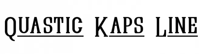
Quastic Kaps Line Font
Quastic Kaps Line Description
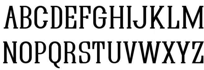
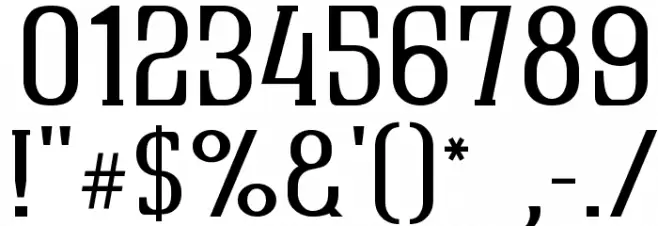
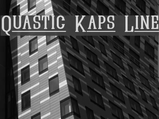
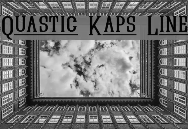
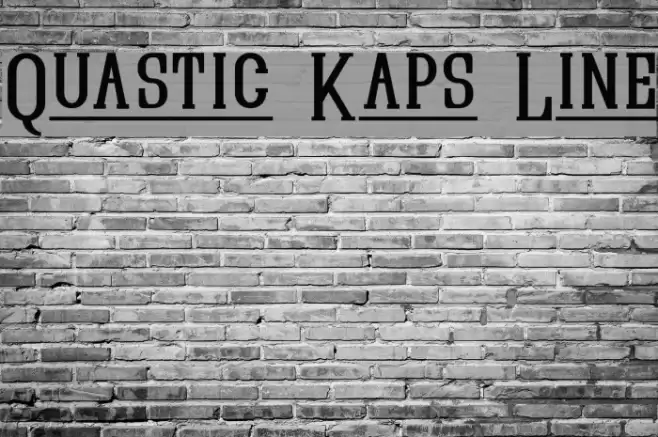
This font features a bold and striking design with strong, thick strokes that create a commanding presence. The uppercase letters are tall and narrow, with sharp serifs that add a touch of elegance and sophistication. The numerals are equally bold, maintaining the same weight and style as the letters, ensuring consistency throughout. The special characters are designed with the same attention to detail, making them stand out while remaining cohesive with the overall design. This font is perfect for making a statement, whether in headlines, posters, or branding materials.
A bold, serif font with strong strokes and sharp serifs, ideal for impactful designs from Uncategorized fonts.
- Downloads: 214
- ( Fonts by Apostrophic Lab FREE )
- QUASIKL_.ttf
- Font: Quastic Kaps Line
- Weight: Regular
- Version: Version 1.5
- No. of Characters:: 303
- Proposed Projects: Ideal for use in headlines, posters, branding, and any project requiring a bold, authoritative typeface.
- Category:
- Bold: Yes
- Italic: No
- Weight: Bold
- Width: Condensed
- Character Spacing: Normal
- Contrast: High
- Overall Style: Classic
- Use Case: Headlines, Logos
- Encoding Scheme:
- Is Fixed Pitch: No
Glyphs ! # $ % ( ) * + , - . / 0 1 2 3 4 5 6 7 8 9 : ; = ? @ A B C D E F G H I J K L M N O P Q R S T U V W X Y Z [ ] ^ _ ` a b c d e f g h i j k l m n o p q r s t u v w x y z { | } ~
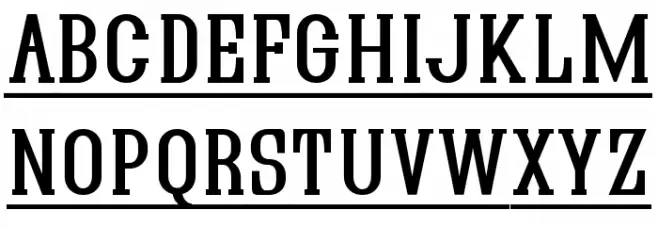
Quastic Kaps Line UPPERCASE
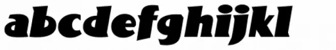
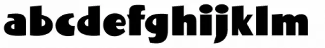
Quastic Kaps Line LOWERCASE
Quastic Kaps Line OTHER CHARS
Gallery Examples
Download Free Fonts
Commercial Fonts Fonts
-
 Buy font Bottle Kaps Commercial Fonts
 -
 Buy font Bottle Kaps Italic Commercial Fonts
 -
 Buy font Bottle Kaps Condensed Commercial Fonts